Unused Batman V Superman Posters Are Much Better Than What We Got
Dawn Of Better Marketing.
I've made no secret of finding the whole marketing campaign for Batman V Superman: Dawn Of Justice a rather big mistake on Warner Bros. part. So dour it was silly, as it rolled on they gave up far too much of the plot and then desperately tried to backtrack, ensuring that when the controversial movie hit it was already pretty divisive.
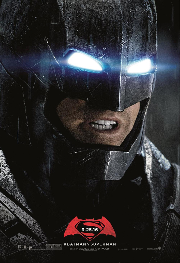
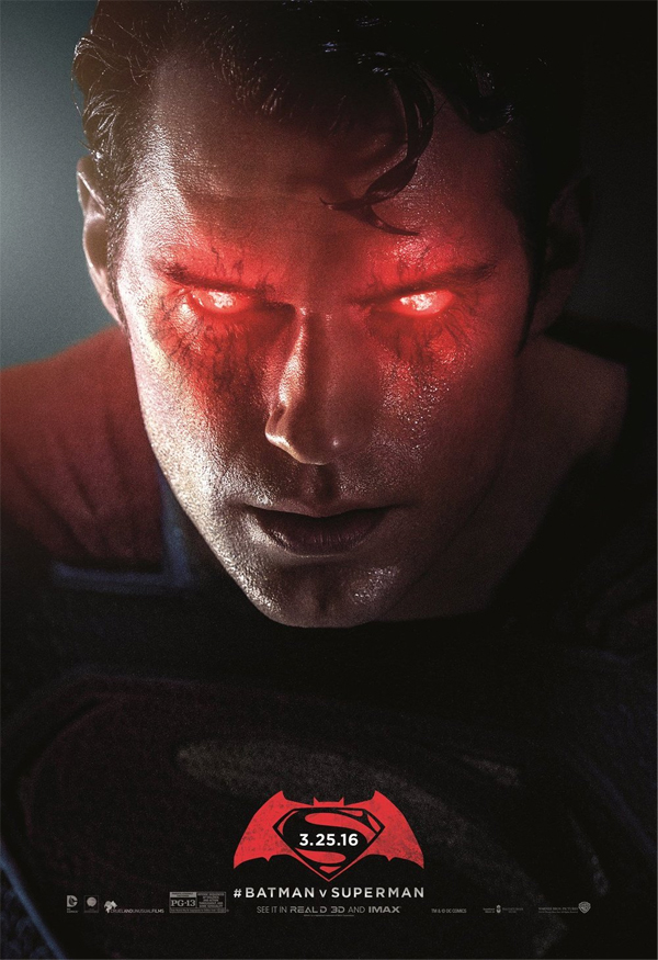
One of the stranger choices in the advertising was the posters, which (after some strange ripped paper effects early on) amounted to various angles of Bats and Supes glaring at each other in a nondescript cloud of debris while big red logos hung about. Striking, kinda, but hardly that memorable.
Well, it turns out these weren't always the sum of the campaign. CBM has shared two unused posters for the film that look much better, with Batman all super angry in his mech suit and Superman reminding you he ain't not boy scout. This gloomy close-up approach is a much stronger choice than what they went with, which makes me wonder why they weren't used. Perhaps the studio realised that, for a movie with such a catching title, the sell to the main public didn't need to be as complicated. Have a look for yourself and share you thoughts down in the comments.