12 Ways Bethesda Should Have Made Fallout 4
11. Give Us A Visual Knockout
'Good graphics' are inherently subjective. You might think something like Okami looks sublime, whereas I might not care for cel-shading. Shovel Knight's pixel art aesthetic is absolutely delightful and charming by me, but to others, it's completely off-putting.
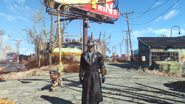
Too often we only look to the shiniest and most lifelike character models as an indicator of what graphics 'should be', and although Fallout 4 can knock you out thanks to some sublime lighting effects and world design, overall it looks decidedly last-gen.
Which is weird, because going back to Skyrim now, is an eye-opening experience. Villages are intricately crafted places that mix a creative designer's touch with a lived-in feel, showing that people have made their mark in various ways. Enemies are all distinguishable and identified through unique animations and attacks - the world itself looks hand-crafted, bespoke and inviting - it's absolutely stunning from river to mountaintop.
Granted, Fallout 4 is a post-apocalyptic wasteland (not that genre tropes should matter, impressive is impressive) but you can tell Bethesda did try to spruce up the colour palette throughout. However, in trying to present what could be a nice visual 'style' (what with its rounded faces, iconography and item aesthetics) feels like a step back.
You need only look to Metal Gear Solid V or The Witcher 3 for an indication of where the bar is on a purely graphical level, as Fallout 4 was very far from its contemporaries in this regard.