7 Video Game Character Redesigns That Directly Insulted The Fans
Sometimes it's necessary. Sometimes... it's just downright sh*t.
Messing with classic video game characters is almost guaranteed to provoke greater gaming nerd rage than taking a blue shell up your exhaust pipe on the final lap of Rainbow Road.
That said, often it’s a worthwhile choice to upgrade a character from the low-poly 3D of the 90s to the modern day, or revamp a tired and out of date look to fit a modern gaming audience.
Sometimes however, it’s just outright awful.
In some cases it goes beyond just looking bad to being a direct ‘’f*ck you’’, aimed squarely at the gaming fan base. Producers meddle with classics and rip childhood icons to pieces for basically no reason.
There's looking bad, and then there's looking really bad...
7. Bomberman - Bomberman: Act Zero
Bomberman was first introduced to the world in 1983 for the home computer, spawning a series that has continued for 35 years. The classic Bomberman look of pink shoes, pink gloves and pink bobble on the head was established and a video game icon was born. He was the cute and lovable animal murderer that could.
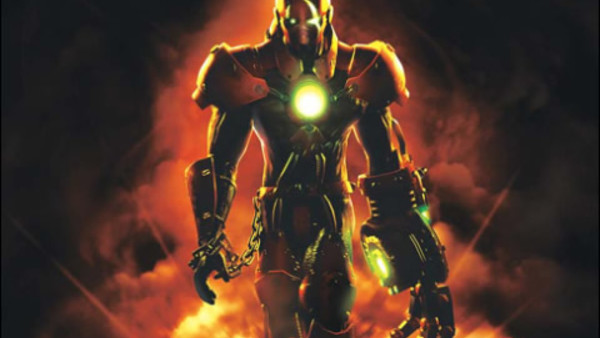
Now take a look of the Bomberman on the front cover of the 2006 Xbox game Bomberman: Act Zero, and try not to vomit. What is this? It looks like the head designer handed his 14 year-old son a bucket of meth and some pencil crayons. Bomberman was cute, not the deformed, illicit love child of Doomguy and a photocopier.
The redesign insulted fans by totally ignoring over 20 years of the franchises gaming history, dropping the gameplay and look, and even giving it a dark, dystopian futuristic setting. This isn’t Bomberman, this isn’t even f**king Dig-Dug mate.
This is just generic, pandering sh*t.