9 Crucial Ways Microsoft Can Save The Xbox One At E3 2017
9. Overhaul The UI
Microsoft have never been the most subtle at hiding their advertisement-fuelled priorities. As such, even back in the days of the 360 blade UI, we always had squares of the screen segmented off to placate the whims of third-party sponsorship deals.
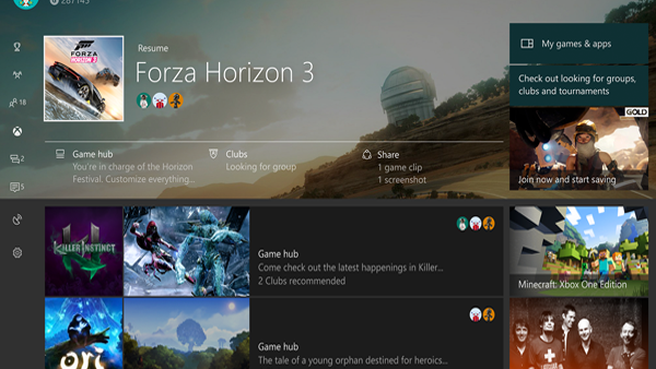
Come the Xbox One, and that ethos went into overdrive. The above image is taken from the latest rework, but despite Microsoft mentioning they'd be 'overhauling' the user experience, we're forever left with an ugly, passionless dirge of icons and redirect prompts. Even on the above image, finding your own game collection is relegated to a tiny rectangular button on the right-hand side.
Whether it's the storefront, your own games (which the system insists on referring to as "managing" when you want to look at memory use or to delete them) or just flicking through the main body of tabs, there's a complete lack of consideration for the end user experience. It goes without saying that Microsoft's "Xbox One is the console for your living room" pitch fell flat on its face, so why on Earth is the actual game store still the last thing you come across when flicking through the dashboard?
Why is it so hard to find a breakdown of the cheapest titles on offer, unique discounts offered through a Gold membership, or where things like background wallpapers are kept?
Spoilers: They're on the official Xbox page, only viewable on the console through the Internet Explorer app. You really couldn't make this stuff up, and it's time for a complete overhaul.