10 Worst MCU Movie Posters (So Far)
For millions of dollars, you'd think they'd have something better up their sleeves.
Poster designs are crucial. Much like the classic "don't judge a book by its cover" which often goes ignored, an excellent movie poster can immediately capture an audience it perhaps wouldn't otherwise attract.
Often, you'll find smaller indie movies testing the limits of what a movie poster can be, drawing in as many people as possible with their unique, intriguing designs.
Blockbusters, however, have a different agenda. With all those A-listers names and company logos to fit onto one design, the urge to just slap a bunch of famous peoples' faces onto one is often too much to resist.
Despite being two of the biggest production partners in the world, Disney and Marvel have fallen victim to this pitfall too many times, as well as just exhibiting general questionable photoshop choices.
With some of the most talented artists and biggest marketing budgets at their disposal, some of the posters we've seen over the years have been unforgivably abysmal.
10. Spider-Man: Homecoming
Without a doubt the worst poster Marvel has ever released, the official North American theatrical poster for Spider-Man: Homecoming is absolutely atrocious.
Not only do all the different directions the characters are looking in give you whiplash by trying to keep up, but the actual pictures of the actors themselves are laughably bad.
The fact that there are two Spider-Mans, two Iron Mans and two Vultures in a single poster is ridiculous, and the shoehorned random snapshots of MJ (and just look at that awful lighting outline around her hair), Aunt May and Happy make it look so scatterbrained.
Fortunately for Homecoming, the solo posters that only feature Spidey are good enough to warrant that this one never ever ever has to be used ever again. Good luck finding a single online movie database that uses this official poster rather than a teaser or character poster because there aren't any. It's just that bad.
9. Spider-Man: Far From Home
Poor Tom Holland.
It's absolutely astounding that this has happened again for the Spider-Man franchise two years after Homecoming's poster became a laughing stock.

Peter Parker's body position is so awkward front and centre on the poster, and the lighting on the side of Jake Gyllenhaal's face looks like he's been pasted in from a completely different poster.
Again, the solo posters for this film are great, and it's likely we'll see those character posters of Spider-Man in various locations around Europe used instead of this abomination.
There is a slightly better version of this main poster that does away with the Spider-Man logo in the background making it look like a weird mixed-up early 2000s poster for X-Men, but it's still not great.

8. Black Panther
This poster unfortunately but hilariously got the meme treatment when someone pointed out that it looked like a bad PS2 game front cover.

It's not an absolutely awful poster, but the awkward amount of spacing in the throne room around T'Challa just makes it look jarringly empty.
Of course, it's only a teaser poster, so it was never intended to be a snapshot of the film in its entirety. But the dullness of the image does very little to capture the epic world of Wakanda. In fact, very few of the Black Panther posters actually use the beauty of its environment to its advantage.
The character posters are all on very dark plain backgrounds that match the colours of their costumes and the main theatrical poster only uses a small portion of its image to showcase the city. And even then it's dark skyscrapers. None of the Black Panther posters actually showcase Wakanda in all its daytime glory.
7. Captain Marvel
While the main recognisable Captain Marvel posters which have their sole focus on Brie Larson are all quite pretty with agreeable colour schemes, the same cannot be said for this poster.
This poster falls victim to the Homecoming effect, and the double Brie Larson present in the image is perhaps even more jarring than having a masked and unmasked Peter Parker due to the fact that they look exactly the same in both images.
Carol may have a different suit on in her two starring roles on this poster, but she looks pretty much the same. She looks like she's got a tiny figurine of her past self thanks to the design placing Vers directly in front of her.
The crossover of the two different settings in the background is not very well done, and the tiny army of marching Kree staring straight down the camera out in front just looks awkward. The overabundance of green suits doesn't mesh well with Carol's blue and red at all and throws the whole thing off.
Plus, check out that photoshop job on Goose the cat.
6. Iron Man 2
A bad poster for one of the lesser Marvel movies.
This poster has a number of problems. Again, with the characters all looking off in seemingly random different directions, they all just looked photoshopped in for convenience sake as opposed to actually looking cohesive.
The lighting around Tony's face is vastly different to everyone else's and the colouring on Natasha is all wrong when comparing her to Tony, Rhodey and Pepper, and that awful curly red wig is shining in all its non-glory. Nat looks like a pin-up girl pasted in to 'spice things up a little', and while that is kind of her vibe for Iron Man 2, it just looks cheap.
Not to mention the weird missing right shoulder of the Iron Man suit behind Tony's head. War Machine is clearly standing behind the Iron Man suit and yet Tony's small head seemingly builds an invisible wall between the two suits.
The choice to have Ivan Vanko beneath them in that environment doesn't mesh well with the dark sky above them at all, and the black fade mixed with the round explosion that separates the environments just ends up looking amateur.
5. The Incredible Hulk (Unused Posters)
While these were ultimately unused, it's still hilarious to look at these absolutely horrendous posters.
It looks like a bad direct-to-DVD cover from the early 2000s, not the movie that helped to kickstart(ish) the MCU with a $150 million budget.
Obviously there's a reason this one went unused, but there are multiple just like it. Awful lighting and pasting of different characters' heads all over the place, terrible facial expressions ridiculous placements of the Hulk aplenty, it's incredibly lucky that these posters never saw the light of day.

Seriously, whoever thought that photo of Edward Norton would ever be acceptable for a theatrical release poster was very, very wrong.
4. The Incredible Hulk
Not that the one they eventually went with was a masterpiece by any standard.

First, the difference is style between Edward Norton and the Hulk behind him is so off. Norton's body is airbrushed and smooth while the Hulk behind him is rough and somewhat blurry. Norton is incredibly bright while the green of the Hulk is dull and subdued. Norton stands out like a sore thumb.
The body looks like it's been pasted in from a separate shoot with incredibly different lighting with very little done to attempt to match it to what's going on behind him.
Plus, that blocky logo with the really ugly attempt at opacity is exactly that: ugly.
3. Guardians Of The Galaxy: Vol. 2
First and foremost: this is not a bad poster in itself. The colours are wonderful, it perfectly fits the vibe of the movie and it's fun. Maybe a little hectic for the eyes to properly take it, but it fits.
The problem is that every main character is in almost the exact same position as they were in the poster for the first Guardians of the Galaxy movie.
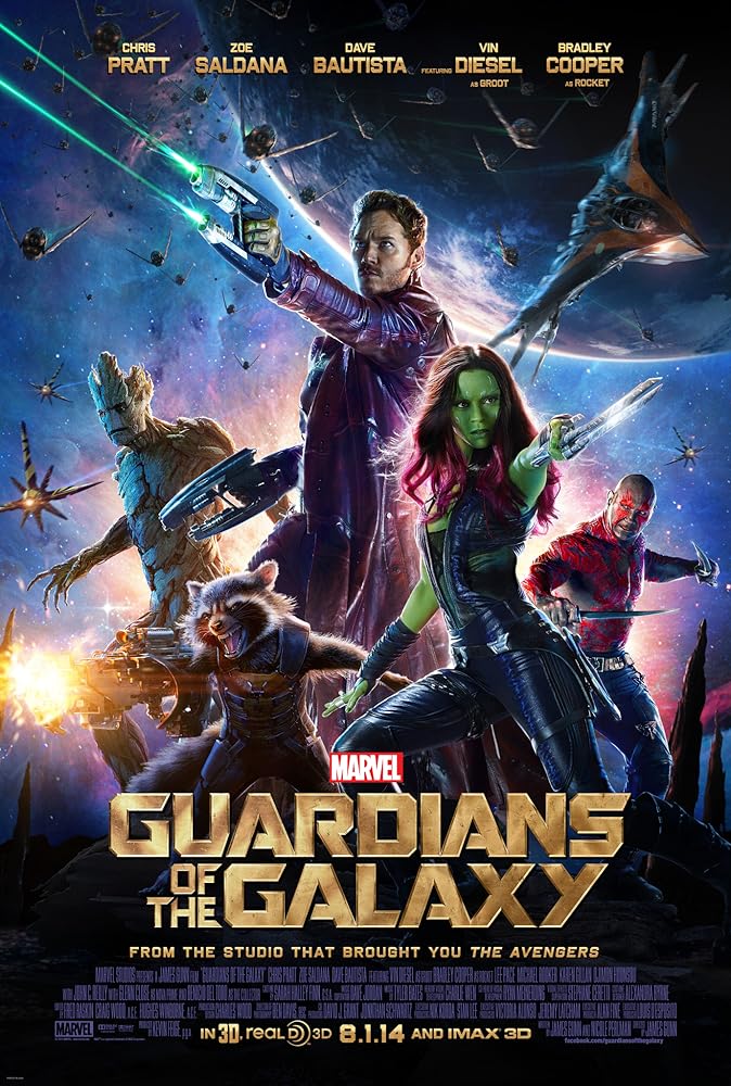
The costumes are the same. The weapons are the same. Some of the character placement is identical. A lot of the poses are incredibly similar. The spacing of the main characters in the middle of the poster is identical.
Gamora looks so similar in both posters that they could easily be from the same photoshoot. Star Lord just looks like he's tilted his body to the side for the Vol. 2 poster. Plus his facial expression is a little weird.
For such a fun franchise and such a wildly brilliantly coloured poster, it just seems like they could have been more creative with how they chose to present these characters for their second outing.
2. Captain America: Civil War
The most common Civil War poster is great. This one is not. It looks more like it was created to be a cardboard cutout for a toy range than an actual theatrical IMAX poster.
The edges around some of the characters are extremely sharp next to a character with extremely smooth ones.
Details on certain characters just look bad, like Black Panther's single leg sliding through the lines of the shield as if he's climbing through a garden fence, or Natasha's eyes almost slipping into the back of her head in that awful shot of her they chose to use. Steve Rogers looks ginger and Bucky looks like he's coated in enamel.
It's just such an odd design with characters deposited awkwardly with wildly different proportions all around it. Probably for the best that this is a far lesser known design.
1. Thor: The Dark World
This poster gets a special shoutout for having one of the strangest photoshop jobs of a character across any of the Marvel posters.
Natalie Portman's Jane Foster just looks all wrong here. First, her neck is abnormally long and her face is twisted at such an odd angle from the rest of her body you'd be forgiven for thinking that her neck had just been snapped.
The facial expression itself is also pretty weird. That gust of wind that she's clearly being attacked by judging by her hair is about to make her melodramatic agape mouth very irritated, and her arms flying about in the air mixed with her dramatic expression makes it look like she's in charge of a strange sort of invisible magic.
In contrast, Thor looks perfectly fine. He's smoldering off into the distance, his hair is blowing correctly in the wind and his body positioning doesn't make him look like someone's accidentally photoshopped his face two inches too far to the left.