11 Worst SummerSlam Posters In History
The bad, the bad, and the ugly.
When it comes to matters of the production department, the
WWE is usually at the very top of its game.
Some of the stage set-ups they’ve delivered in the past have been nothing short of spectacular, and still to this day I find myself going back and watching video packages from years gone by.
But another aspect of the company’s production that has been a little more hit and miss at times, is the promotional posters they put out for pay-per-views. Sure, it may not be the most major of elements, especially in today’s digital age. But often, the PPV posters provide the lasting image with which we remember these shows.
And in the case of SummerSlam especially, there have arguably been more misses than hits.
Granted, they’re doing a much better job than I could ever hope to do. But still, some of the renderings we’ve seen in the past have been questionable in one way or another.
So in the spirit of celebrating the bad and the ugly as well as the good, this article looks back at some of the less captivating posters from SummerSlams gone by.
Note: Most of the posters have had to be cropped to fit into this article, but if you fancy checking out the full-size images they're all readily available on Wikipedia, with links embedded throughout the article.
11. 1990
First up on the chopping block is the effort from 1990.
The PPV it was advertising was absolutely packed with talent, headlined by a cage match for the WWE Championship between the Ultimate Warrior and Rick Rude. Elsewhere on the card, Hulk Hogan took on Earthquake, Randy Savage faced Dusty Rhodes, and there were further appearances from Jake Roberts, Bret Hart, as well as a rookie Shawn Michaels.
The poster, however, wasn’t quite as impressive.

To me, the biggest issue is its simplicity. The stock image on a black background isn’t quite enough to convince me to purchase a wrestling show, and the wrestler's photos are on such a slant that you find yourself craning your neck just to try and make sense of it.
Maybe I’m just being lazy, but neck stretches aren’t what I look for in a PPV poster. That being said, I’ve refrained from placing this one any higher since it is, after all, even older than I am.
10. 1989
An even older instalment now, this one coming from a year prior.
As you can see, the company were clearly going for some kind of gaming vibe here, and this was of course during a time when the original Street Fighter was taking arcades by storm. But as nice as the idea might have been, its execution was a little on the cartoonish side.
Again, though, this was one from before my time, so it’s difficult to say how it was received in the day. It may have been fairly cutting edge for 1989, but today it just looks rather dated. And that’s not to say that the retro theme doesn’t work anymore, as was proved by that awesome 8-bit Roman Reigns promo for TLC.
But still, even if we gloss over the gaming theme, the SummerSlam logo on the full-size poster is far too jittery and somehow they’ve managed to make Brutus Beefcake’s face look photo-shopped—despite the fact that it’s not even a photo.
Whether or not it was fitting for its time, and as nice as
the idea may have been, the delivery was just a little wayward here.
9. 1998
Another case of decent thinking not quite being backed up by
the final product here, as we move onto the poster for SummerSlam 1998.
Taking place right in the thick of the Attitude Era, this was arguably the WWE’s most successful period. A top-drawer show, featuring an excellent ladder match between Triple H and the Rock, was headlined by the titanic Stone Cold Steve Austin vs Undertaker clash for the WWE Championship.
And the WWE clearly tried to convey the magnitude of this meeting by portraying their main event pair as the larger-than-life stars that they’d both become.

However, they missed out a fairly vital detail in neglecting to give Austin a neck. I know he’s had problems with the old stack of dimes before, but that doesn’t mean they had to draw him without any neck whatsoever.
I hate to point the finger but it just looks like a fairly amateurish depiction—though admittedly it’s now almost two decades old. Again, a nice idea but not quite the kind of delivery that you might have hoped for.
8. 2007
A much more recent entry here, and therefore no excuses for this one. Though there wasn’t necessarily anything wrong with the 2007
poster’s final product, the concept it was based upon was somewhat
lacking.
SummerSlam 2007 was of course the site of Triple H’s big return after a seven-month injury lay-off, and so WWE went all out by presenting him as the PPV’s top draw. And while “the party is over” was a pretty strong tag-line, it was slightly let down by the chosen image—stroppy Triple H, as opposed to vengeful Triple H—and I’m not sure why they had him chilling on a desert island…

Plus, there was plenty more going on at this show that just Triple H’s return. Batista was challenging for the World title, although admittedly it was against the Great Khali, whilst the main event pitted John Cena against Randy Orton, back when that feud was still a fresh one. Surely that’s worthy of a mention?
All in all, and given the timing of this release, you get the impression that Triple H’s stroke backstage might have had a helping hand in the design of this poster.
7. 1994
Back to the dodgy-poster-haven of the ‘90s now, and
specifically that of 1994.
As you can probably tell, the big feud heading into this one was The Undertaker vs. The Undertaker. Or, at least, the real one versus the imposter ‘Taker.
And again you can see what they were trying to achieve here, but unlike the previous case of 2007, the reflection-in-the-broken-glass concept is let down by a lacklustre tag-line. “So hot, it’s scary” sounds like it took all of three minutes to come up with, and just feels like a bit of a desperate attempt to somehow tie the Undertaker’s gimmick to that of the PPV.
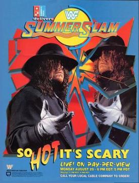
Credit where it’s due, though, I am a fan of some of the font choices.
But back to underlying idea, and the decision to go all in on ‘Taker means that there’s absolutely zero mention of the Bret Hart vs. Owen Hart WWE Championship bout—which would ultimately receive one of the only five-star ratings in all of company history.
For that kind of oversight, plus of course the corny
tag-line, 1994 deserves a mention as one of the less-fondly remembered
SummerSlam posters.
6. 1993
And speaking of bad tag-lines, they don’t come much worse
than that of SummerSlam 1993.
“Fat chance!”, were the iconic words that the company decided to roll with for the summer PPV. This was in reference to the plus-sized Yokozuna, who headed into the event as WWE Champion after a blistering debut year in which he'd previously lost on just two occasions.

But who was it who had the fat chance—Yokozuna? Or his opponent for the title, Lex Luger? You’d have thought it would be Luger, given that this would be his only shot at the title, and he’d been forced to wear a protective pad on his forearm. But then, the accompanying tag-line was “somebody has to stop him!”, which suggests it was in reference to Yokozuna. Continuity, guys!
Plus, the poster itself featured an image of the champion hitting the United States flag with his patented Bonzai Drop finisher.
It felt like another attempt at comedy, but given how seriously they were taking the “All-American hero” Lex Luger, it didn’t quite add up with the story surrounding the PPV.
5. 1991
Now, I can’t say I’m sure which software they’ve used for
their posters over the years, but it looks like 1991 was the year that someone
was experimenting with Microsoft Word—although I must admit I’m not familiar
with the program’s capabilities way back then...

But on the SummerSlam poster of the corresponding year, we saw all the textbook WordArt gimmicks incorporated, from vertical text to gradient effects. And on top of that, the images were crudely pasted onto another rather bland-looking background in what’s hardly the most compelling of adverts.
Again, time hasn’t done this one any favours. But unlike some of the previous efforts, I’m not even sure this one looked all that great back in the day when it was released.
I guess this could have been a whole lot worse, though, given that the show was headlined by a wedding. Let’s just be thankful that they veered away from going all in on that theme in the end…
4. 1995
For staging round two of Shawn Michaels and Razor Ramon’s awesome ladder match escapades, SummerSlam 1995 will be fondly-remembered.
The poster, however, not so much.

Again the designers went all in on just the main event feud, although they only included one half of it. And unless the “feel the heat” tag-line was an inside reference to the heat being garnered by the Kliq—which we can just about guarantee it wasn’t—this was the second year in a row that the WWE tried to go with the seasonal tie-in rather than promoting their actual storylines.
Also, like in 1991, the wavy font of the “face the heat” tag-line looks like someone was looking for an excuse to experiment with new effects.
Still, SummerSlam 1995 came at a time when business was indeed falling, so you could argue they didn’t have much to work with here—bear in mind the main event was Diesel vs. King Mabel. Then again, is it any wonder that business was down when the promotional material looked like this?
3. 2006
SummerSlam 2006, on the other hand, featured a far stronger
all-round card, headed up by Edge vs. John Cena for the WWE Championship, and
featuring some big-name undercard contests including Hulk Hogan vs Randy Orton
and Ric Flair vs. Mick Foley.
But you wouldn’t have known any of that by looking at the poster, because the WWE decided to really ham it up with the “entertainment” element this time.

This was the first time the “biggest part of the summer” tag-line was used, and the company weren’t about to let us forget it. In keeping with the party vibe, they produced a poster depicting all the shenanigans from a hypothetical WWE barbecue.
D-Generation X took centre stage, where Triple H was wielding a noticeably lager sausage than that of Shawn Michaels. And in the background we had Cena taking a dive into the pool, the Spirit Squad doing some gymnastics in the garden, Rey Mysterio getting his tan on, and Kurt Angle desperately trying to look somewhere close to serious.
It’s so ridiculous that it almost goes from being so terrible that it’s actually quite brilliant. Still, as wacky and fun as it might have been, it’s not quite the advert you’d expect for a wrestling show.
2. 2004
With SummerSlam 2004 coinciding with the first weekend of
the Athens Olympics, the WWE went all out with jumping on the Games’ bandwagon.
At least that’s a better basis for a theme than simply referencing the summer
temperature…
While the tag-line “let the games being” was solid enough, again it seems like they then tried to add some comic relief to the mix.

The poster featured various wrestling moves being adapted and spoofed into Olympic sports, including Big Show’s gorilla press being the advert for powerlifting, and a double-clothesline from Batista demonstrating the parallel bars.
It seems like this one was fairly hit-or-miss, because some people seemed to be keen on the idea. But to me it all felt like they were trying too hard and was, at times, a little cringe worthy. And furthermore, the poster also featured images of a cage match and tables match, even though neither stipulation would feature on the show.
Even if you’re a fan of the Olympic-theme, advertising matches that weren’t even on the show seems like a promotional no-go in my book.
1. 2013
But at the top of our list is none other than 2013’s roller
coaster instalment. Because SummerSlam and roller coasters go together, right?
In a similar situation to 2006, it seems like they were really hitching their load to the “biggest party of the summer” theme. But they took it to the point that this rendition just didn’t look like a poster for a wrestling show.

There was no mention of matches, rivalries, or any of the show’s actual content. And furthermore, why did we see this particular cast of theme park-goers?
The card featured Brock Lesnar vs CM Punk—with the Beast vs the Best tag-line which would make any poster look great—as well as a long-awaited WWE title shot for Daniel Bryan against John Cena. And yet none of that was referenced on the poster, other than a quick glimpse of Punk and Bryan in the back rows of the ride.
Still, as random as the thinking behind this poster was, it seemed to mark something of a change in mind-set, as subsequent posters were far more focused on the matter in hand: that being the promotion of the actual matches that would feature on the show.
And thankfully, if this year’s poster is anything to go by, it
looks like it’s a trend that’s here to stay.
