Avengers: Age Of Ultron Concept Art Shows 6-Armed Villain & Alternate Hulkbuster!
The Hulkbuster was almost twice as big!
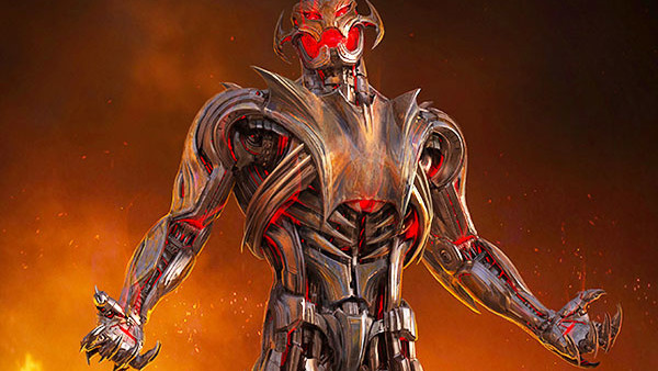
Thanks to some newly released - and stunning - concept art from Avengers: Age Of Ultron, we've now been given some fresh insight into the villain we almost got to see in the sequel. Though James Spader's robo-baddie was a great performance (shut up, the ham was glorious), there were some issues with his final form design that it was hard to ignore. In short, he looked a little bit goofy.
The concept art was released courtesy of Josh Nizzi, who also designed alternative versions of Tony Stark's Iron Legion, Baron von Strucker, and the HYDRA soldiers, which can be seen on his site.
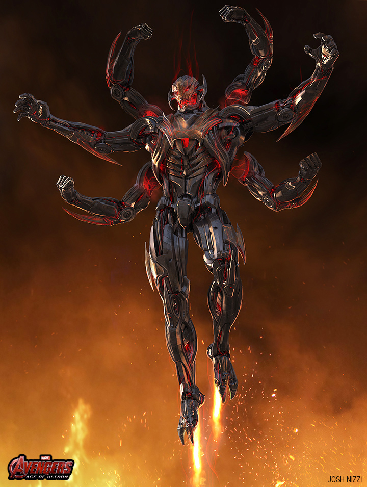
It's a shame that some of the other designs on the table weren't considered more viable options for Ultron. Because the image of a six armed Ultron towering over the Avengers would have been brilliant...
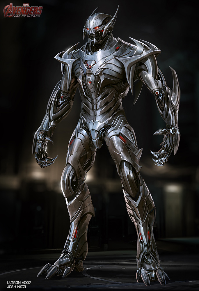
Alternatively, the more spiky looking variation would also have been an improvement...
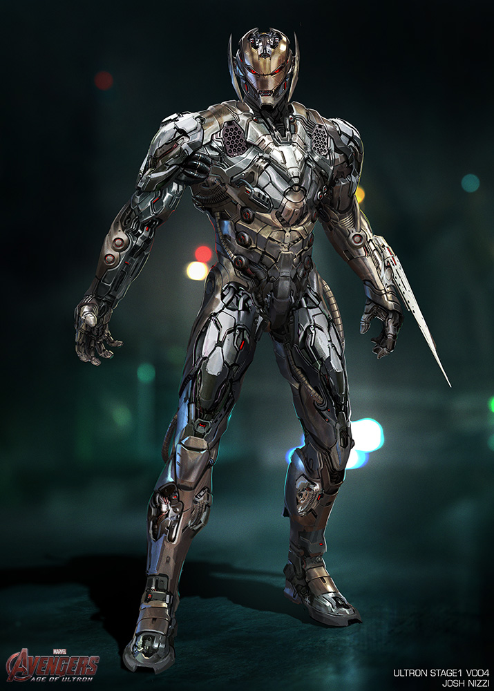
Or even the one that looks a lot more like an upgraded Iron Man. That would have at least made more sense narratively, given Ultron's Oedipal issues with Tony Stark...
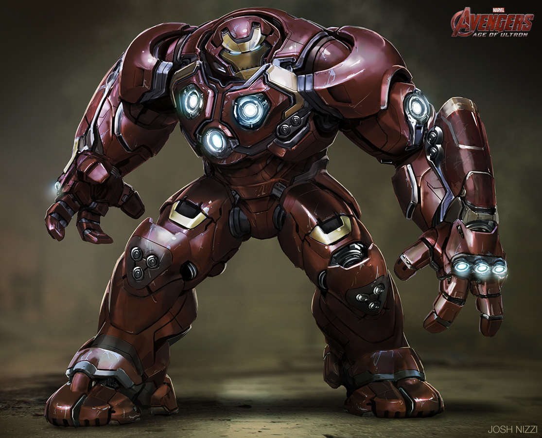
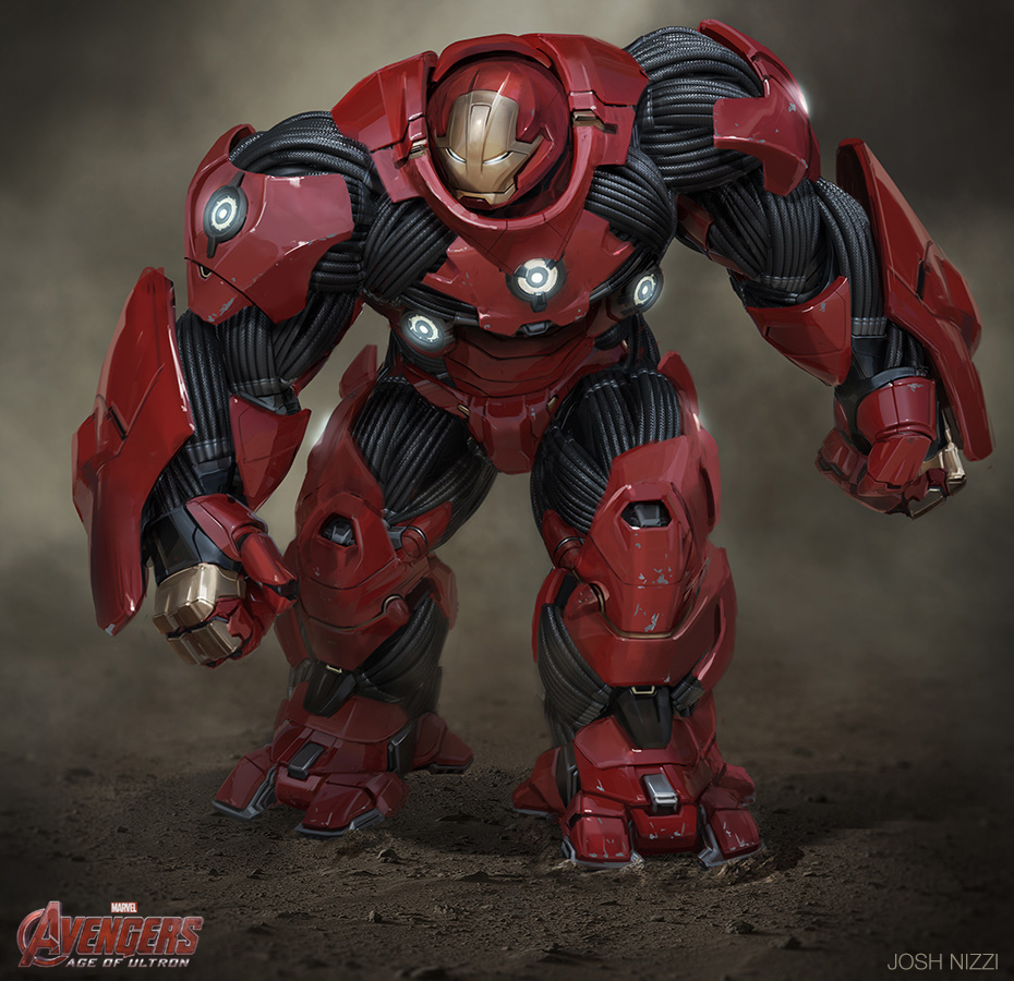
The dump of images also includes a couple of Hulkbuster variations, most of which look closely like the version that ended up in the film, albeit with slightly different details...
Personally, I like the black sinewy muscle design...
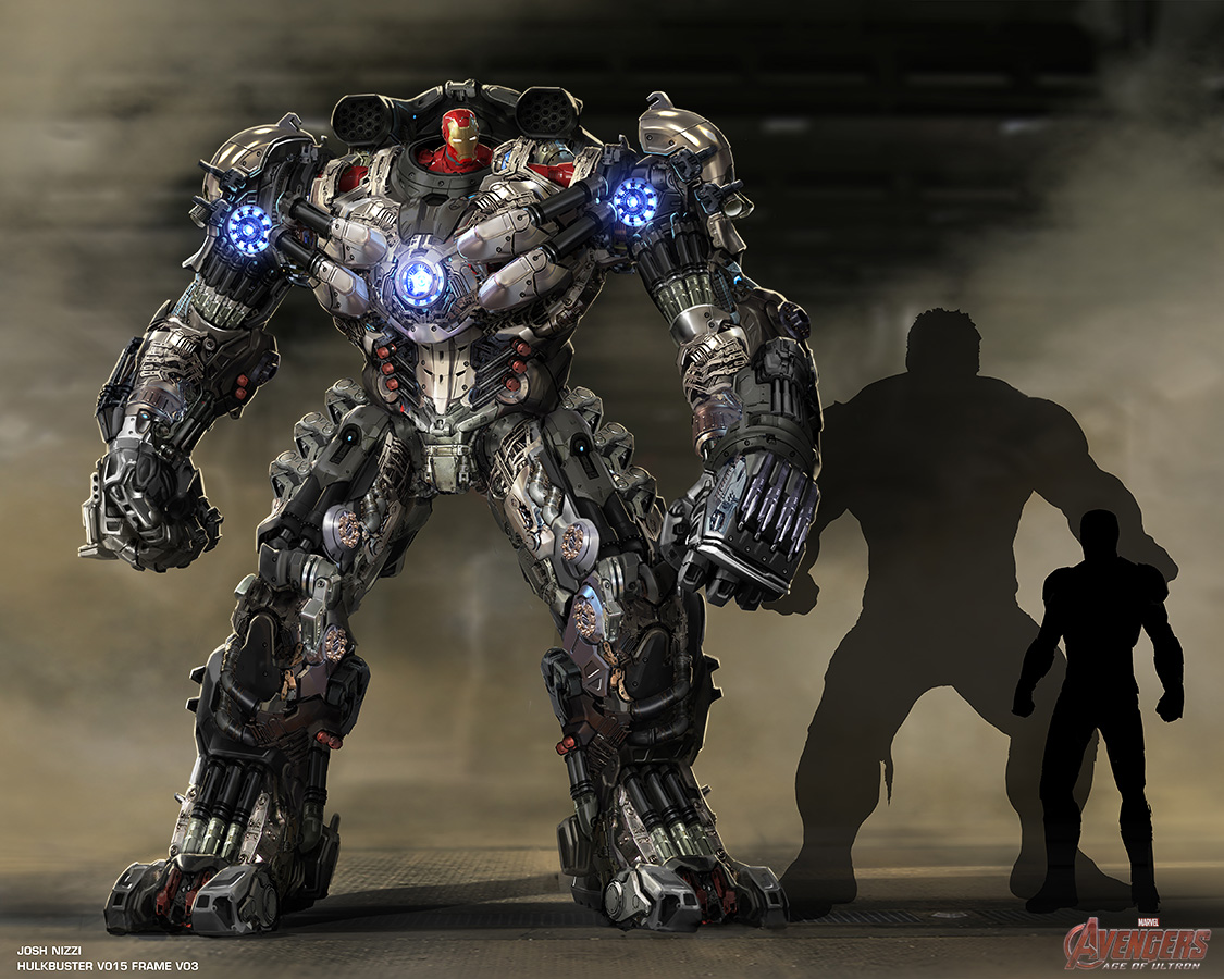
The most intriguing of all is the suggestion to have Hulkbuster tower over Hulk - an increase in size on the final version of roughly twice, though there's no way Tony Stark would ever have designed something so unpolished. It's just not stylish enough...
Which of these designs would you have liked to have seen in Avengers: Age Of Ultron? Share your reactions below in the comments thread.