Batman v Superman: Superior Doomsday Concept Art Revealed
Look what we could have won...
It goes without saying that the design of Doomsday - who looked rather a lot like an unfortunate hybrid of a Teenage Mutant Ninja Turtle and a Middle Earth cave troll - was one of the biggest complaints fans had of Batman v Superman. He might have evolved a little more into what we'd expect from the character (aside from his brain power and complete lack of eloquence, of course), but the problems lay with him not really looking like the comic book iteration.
That's always a problem when it comes to adapting iconic characters. It's not like you'd introduce a Batman who didn't wear a Bat-cowl. Or a capeless Superman...
Anyway, it turns out that we almost got a far more traditional take on the character, which actually looked a lot better than what we got in the end.
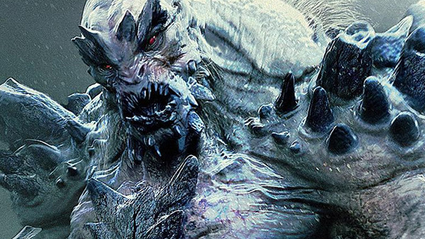
Concept artist Jerad S.Marantz has shared some of his early concept designs for the iconic villain, showing that he tried to introduce a Doomsday who fits a lot closer to the version we've seen on the page over the years. The first shot definitely has some angry winter monkey vibes about it...
The second is definitely the best one...
And the third is a little much, to be honest, but it still makes the final film version look inferior in direct comparison.
Which of these concept designs do you like best? Share your reactions below in the comments thread.