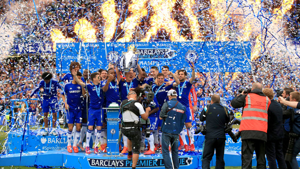
Every year, fans eagerly await the arrival of their team's new home kit. While the base colours rarely change, small quirks can make or break a team's aesthetic for an entire season. How does the new sponsor look? Was the introduction of a new collar a wise decision? What changes have the kit manufacturer implemented? Football kits can go down in history, for better or worse. Newcastle fans often long for the days of their mid-1990s Brown Ale-sponsored home kit, a symbol of Kevin Keegan's "entertainers" but at the same time you'd be hard pressed to find a Southampton supporter eager for the return of their 2011/12 pinstripes, a wild deviation from the traditional red and white. Here's a ranking of 2015/16's Premier League home kits, from worst to best. Where does your team place?
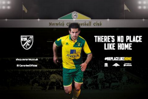
20. Norwich
Norwich's new kit is rendered the worst of 2015/16 for one simple reason: the sponsor. Errea's decision to place the Aviva logo inside a giant yellow square completely ruins the shirt's half-and-half design, making it the ugliest kit of this year's Premier League season by quite a margin. The Canaries have already been given a lot of stick on social media for the fact their home, away, and third kits all prominently feature yellow and green - but their home kid is honestly worthy of such ridicule on its own.