12 Ridiculous Early Concept Designs Of Iconic Characters
2. Sonic The Hedgehog...Again
Sega had already learned to not make a functional mascot, but Paramount needed to learn that same lesson.
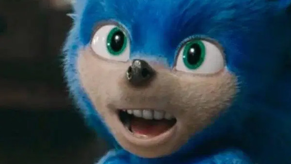
Sonic fans are notoriously rabid and constantly at each other's throats over the most miniscule things, what color Sonic's eyes should be, at what point the series went downhill, or who has the best chao. They usually never all agree on one thing, but Paramount managed to get them to come together in hatred when they unveiled their design in the first trailer for their Sonic The Hedgehog movie.
Disturbingly realistic hair, visibly prominent teeth, a stubby and rat-like nose, with eyes three times too small for his giant head. The fact that this design passed so many phases of development, from concept art, to modeling, to animating, without anyone seeing anything wrong is truly appalling.
The fans violently rejected whatever creature Paramount pushed forward. The trailer was almost immediately taken down after getting panned, and the film was delayed until February so that the animation team could create a less aesthetically offensive main character. This became one of the first instances where a company actively capitulated to fan pressure in an attempt to salvage a bad movie.
In the long run the decision worked, as the film made over 3 times its original budget.