Premier League 2019/20: Every Home Kit Ranked!
At least two teams are strutting actual struts this season.

The football! It's back! It never really went away, given the Champions League final was in June, we had a whole World Cup, and then the Champions League kicked off again pretty much the next day but... yeh... it's back!
Of course, the happenings on the pitch have long since ceased to be anything resembling interesting, as Man City continue their infinitely funded project to amass more points than the combined colleges of Oxford and Cambridge on any given series of University Challenge. Like the Oxbridge swots, Pep Guardiola's elitist dominance is as distasteful as it is dull, somehow succeeding in the seemingly impossible task of defining Liverpool as likeable underdogs.
Of all their achievements, that ranks amongst the highest.
So no, forget the footballs, but stay for the fashion! In the unreality era, where truth is false and false is fact, outlandish and unbelievable kits have sadly lost their some of their power to amaze. This might be why Huddersfield flouted FA laws with their PR stunt apparel, or explain Roma's stupendous Ziggy Stardust away kit. After all, it's very difficult to raise eyebrows with some embossed nylon in 2019.
And this year, the collective Premier League hasn't really tried. Instead, we have a rare set of fairly elegant designs, a really bold diversion, and one which looks like a go-home p*ss stain. The latter is one of the best, somehow.
20. Bournemouth

The gesture of the model on the far right really says it all: it's a new Bournemouth kit alright, but so what? An apparently camera-shy Josh King might as well have just told her he's revamping the Cherries' current affairs output. Deathly dull stuff.
19. Brighton & Hove Albion

The Seagulls just narrowly avoided being washed out to sea last season, and by the looks of it, the whole experience left Lewis Dunk a changed man - and not for the better. He's certainly not enthused by Brighton's new kit, which now has tiny black lines to create a misleading glossy velvet effect. Interestingly, it's identical to Hove Albion's new strip.
18. Aston Villa

"Hiya mum, it's Tyrone. Can you pick me up from Witton train station? I'm in my full kit, and I look like a right w*nker." Aston Villa were eventually relegated from the Premier League three years ago, having lingered like a foisty damp smell for the better part of the 2010s. Their new and tedious kit makes it feel as though they never left.
17. Crystal Palace

The ultra-saturated hues and excessive detailing give Crystal Palace's latest home shirt the a mid-'90s Barcelona vibe. The football on display by Roy Hodgson's Selhurst Park boys generally does not. Ronaldo Connor Wickham ain't.
16. Burnley

It didn't seem possible for Burnley to come up with a more unintentionally obscene sponsor than last season's 'BetClitoris' or whatever it was (It was LaBa 360 - Ed.), but by Jove they've done it. If it weren't for the giant, sexual Chinese betting firm taking up 90% of its real estate, this'd be real lovely stuff from the otherwise impossible-to-like-for-no-reason Clarets. Maybe it's Sean Dyche.
15. Sheffield United

Presumably jealous of Sunderland's League One-tastic 'Brexit' kit, South Yorkshire shirtalikes Sheffield United have slapped a big ol' Union Jack on their own strip - only by choice, ironically as part of their newly-brokered sponsorship deal with Australian bank USG. Other than that, the Blades' threads are cut from the same cloth as most previous efforts.
14. Liverpool
1400492Liverpool prematurely ejaculated their 'new' home ahead of the failed Champions League tilt opposite Real Madrid last spring, so evidently superstitious, elected not to repeat the trick for their second consecutive final last month. Clearly, it worked. Or maybe it's just that the shirt itself is nothing really to telegram home about.
13. Manchester United

Paul Pogba's sullen face has been cropped out of the above image to better demonstrate Manchester United's new nylon, as could well be the case with all the club's official literature come the close of the transfer window. There aren't too many surprises with the Red Devil's obviously red shirt, which almost wistfully celebrates a time when they used to be good two decades ago, featuring the same crest worn during their 1999 Champions League triumph. They didn't have a big, horrible sponsor logo then though.
12. Wolverhampton Wanderers

Just what is João Moutinho pondering here? Is it, perhaps, the really weird texture of Wolves' very typical 'old gold' garb? It's perfectly possible it's stitched in such a way so that it shimmers like the Molyneux' club's famous 'floodlight kit', designed for European dates in the '50s. We'll find out when they play mid-week on the continent for the first time since 1981 later this season.
11. Tottenham Hotspur

Although Mauricio Pochettino's boys failed to win any silverware last year - and even failed to move house on time - they did sweep home a magnificent double for worst home and away kit. Sadly, it looks like 2020 will end empty handed, as the new Spurs outfit is merely dull, not diabolical. The unresolved V-neck is a tad annoying, but on the plus side, the shirt - as depicted by Harry Kane in classic 'left the iron on' pose - can apparently float! That'll save on hangers.
10. Leicester City

It's been three seasons since Leicester won the Premier League, and yet they still persist with the celebratory gilded detailing. It's bordering on 'slightly sad' now. That said, the strip returns to traditional white shorts, and the chequerboard effect makes it look like a level from Sonic the Hedgehog, which is obviously good.
9. Newcastle United

You know what? Newcastle's put-upon fans have a lot of things to justifiably mither and moan about right now, but this retro-inspired kit - as modelled by a knock-off Fabricio Coloccini - isn't necessarily one of them. Sure, the sponsor's as big as Portugal, and the logos are rather slapped on, but it has actual stripes which even extend to the back. A real Steve Brucey Bonus.
8. Manchester City

Man City were a bit like the mascot lion of a municipal zoo last season. Everyone was wowed by its sheer majesty, but the fun sort of dried up when it ran amok and ate literally every one of the other animals. In winning an unprecedented domestic treble (yawn), The Blues ironically set their soft-power project back a notch; the football ceased to be interesting, so questions about the regime were asked instead. That said, this futuristic kit is annoyingly nice.
7. Chelsea

What it's supposed to represent: The distinct shadows cast on the luscious green of Stamford Bridge by the stadium's various joists and beams.
What it actually represents: The opening sequence of Saved by the Bell:
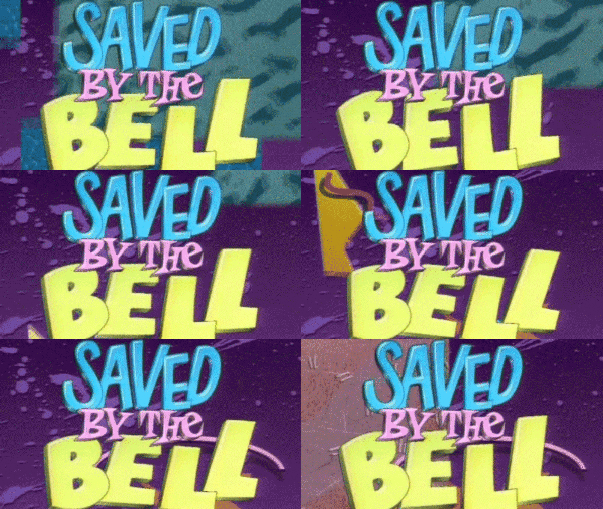
This is a good thing.
6. Everton

Like Chelsea's similarly striated effort, Everton's new strip takes unusual inspiration from stadia struts - Goodison Park's Bullend Road Stand, in this instance. These architectural homages are certainly original, even if they are utterly arcane. Anyway, the shirt's a good 'un, though Gylfi Sigurdsson doesn't seem to agree.
5. Southampton

If this were the 1700s, Nathan Redmond and pals would be very close to contravening some sort of Seditious Meetings act, milling around all conspiratorially on the Saints' training ground as such. Luckily, it's not the 1700s, and instead, they are just casually showing off a rather striking but splendid Southampton kit. It's like previous Southampton kits, but has a big black splodge on it. Yay.
4. Norwich

Errea rarely let you down. After last year reintroducing the classic and totally appropriate 'bird sh*t' kit for the Canaries, the Italian sportswear one-less-than-giant have got all excited about the features on their brand spanking copy of Deluxe Paint IV, opting for this snazzy gradient effect. It wouldn't look out of place in Johannesburg or Melbourne. After all, they do say the Broads are 'Norfolk's Veldt'. Maybe.
3. West Ham United

The Hammers' bold new home shirt reintroduces the blue in 'claret and blue' in a big way, courtesy of a massive yoke on the front supposedly inspired by the cup-winning clobber of 1980. According to Umbro, that was 40 years ago. Forty years. B*llocks to West Ham for making us feel so incredibly, incredibly old - even if the kit's gorge.
2. Arsenal

Puma had been going increasingly off the rails with their last few Arsenal kits (if degrees of that cliché are possible, anyway), adding massive white panels and pinstriped armbands which dithered to pink from a distance. We also heard they told Arsene Wenger to "f*ck off you duffel-coated t*sser" during his valediction. So it's safe to say Adidas' return is more than welcome, and they've played the reunion safe with this smart, sensible and rather svelte new strip.
1. Watford

Relative to the fake and frankly fabulous jacquard kit doing the rounds ahead of official launch, this Watford attire is downright reserved. Except it isn't, is it, because it's half black and half yellow, a truly distinct look for the Hornets which brings to mind an exotic salamander or, even better, a pencil. Point is, it's a beaut.