6 Video Game Sequels With Worse Graphics Than The Original
4. Silent Hill 4: The Room
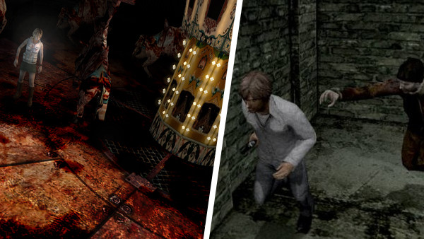
Though it's not a bad game by any means, Silent Hill 4: The Room didn't match the same quality of the original trilogy, with everything about the project feeling a little lacking in inspiration. That extended to the visuals as well, as while the monster designs were as imaginative as ever, Silent Hill itself looked more boring than terrifying.
Admittedly, it was the overall art direction which was the biggest problem. The developers seemingly only had one colour at their disposal, resulting in the majority of the world being drabbed in different shades of grey. Consequently, hero Henry is barely distinguishable from the environments he's placed in, and even the transition to Silent Hill's hellish other world doesn't change the aesthetic all that much compared to the third game.
Gone are the atmospheric juxtapositions between light and dark found in the third title, which was always hiding who knows what in the shadows, replaced instead with uninspired warehouses and "spooky" woods where even the trees were grey.