7 Most Insane Things Happening In Wrestling Right Now (June 9)
Frame-jobs, flakes and f*ckboys.

On Monday's RAW, The Miz indirectly buried himself by vowing to restore prestige to his newly-won Intercontinental Title, like he was Cody Rhodes six years ago.
It seemed to have escaped Miz's attention that his nothing reigns have become synonymous with the what the championship has devolved into: a heating device tossed around arbitrarily as a means of giving midcard acts something to do. The Miz didn't restore the gold back to its former glory in 2012, when he embarked on a nothing 85 day reign with it. Nor in 2013, when he embarked on a nothing one day reign with it. Nor in...
Really, the only feud of note Miz has waged over the gold was his series with Dolph Ziggler last year. That WWE constantly undermines the title by blathering on about how it was prestigious several decades ago is incomprehensible. The Miz is a great act. He doesn't need to invite unflattering comparison to better workers from a bygone era in which his company actually cared about the title they held. Thing is, it's not so much insane and mundane; WWE has held a bizarre, counterproductive grudge against the Intercontinental Title for years.
It is not even the longest-running nor most insane in wrestling right now.
7. Somebody In WWE Other Than Triple H Is A Big Fan Of D*ck Jokes

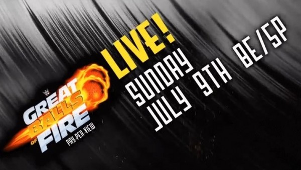
In news from the files of "You couldn't make it up," WWE has this week somehow contrived to conceive of something more embarrassing than the name of the upcoming Great Balls Of Fire pay-per-view: its logo.
For a company that has reduced Bayley from relatable woman with heartwarming inner child to actual toddler, WWE isn't particularly heavy-handed when designing their PPV logos. The No Mercy font might as well be Times New Roman, for how generic it is. WWE gets giddy in the summer heat and uses two whole fonts for SummerSlam. Backlash isn't a picture of Vince McMahon sweating over recent ratings.
Which makes the second of three GBOF logo designs as inscrutable as it does hilarious. WWE went with a graphic of two balls of fire that weren't so much great as they were very obviously reminiscent of two testicles. A burst of rocket flame propelled them past the text, which, of course, was fashioned in the shape of a d*ck. It looked more like E.T.'s finger, in truth, but the placement was enough to cause widespread titters.
You'd think somebody would get fired over it, but this was clearly the work of the mastermind behind the equally hilarious Sin Cara t-shirt disaster of 2011.