10 Great Films That Are Ugly On Purpose
When a "bad" aesthetic is actually the right choice.

Making even a basically decent-looking film is a hell of a lot harder than most viewers will ever realise, and so to make something on the beautiful level of, say, Blade Runner 2049, is a truly herculean feat of artistry.
And while Hollywood is full of visually unappealing films you'd never give a second look, there are also those rare great movies which intentionally offer up a deeply offputting aesthetic.
These 10 films are all terrific works of cinema in their own right, yet undeniably roughshod on the visual front, serving up purposefully iffy cinematography, editing, camerawork, and so on, all in the quest of achieving a specific mood or vision.
Whether to place the viewer within a character's disorientated headspace, support the film's own chaotic themes, or simply assume a greater air of realism, these movies all utilised their lack of polish to their sure advantage.
The results clearly aren't for everyone, but these films nevertheless proved that, with the right filmmaker at the helm, it's possible to deviate from the typicality of Hollywood filmmaking in a way that's effective in its absolute unattractiveness.
Whether you dig these films or not, the naked artistic bravery on offer is undeniable...
10. Natural Born Killers
Despite its mixed critical and commercial reception, Oliver Stone's Natural Born Killers is one of the most boldly provocative films of the 1990s, and arguably the director's last truly visionary movie.
Stone takes the prototypical Bonnie and Clyde formula and gives it a jolting amphetamine injection through not only his unsubtle critique of American culture, but also his intentionally offputting visual style.
From first frame to last, Natural Born Killers is a pure assault on the senses, containing an insane 3000 cuts which took Stone 11 months to edit, while the film's overall visual identity is defined by queasily neon-soaked imagery and sudden camera angle changes intended to disorient the viewer.
While critics and general audiences alike weren't sure what to make of Stone's film, its wilful ugliness ingeniously held up a mirror up to the very ADD-riddled mass media culture Stone was satirising, exposing its shallow stylishness in the process.
9. Magic Mike
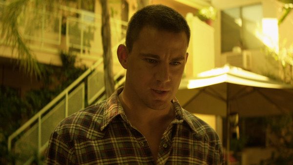
As unexpectedly terrific as Steven Soderbergh's male stripper movie Magic Mike is, it's also a film which frequently - and intentionally - invites nauseous feelings as a result of its hideous camera filters.
Soderbergh made the decision to shoot the majority of the film's scenes with double straw filters, giving them an offputtingly jaundiced, washed-out look.
Basically, this was Soderbergh stripping the sexy saturation out of the film's sun-kissed Miami scenes, instead exposing the soullessness of the stripper life once they're off the stage - a major theme of the movie.
In fact, the only scenes Soderbergh shot without the filter take place in the various nightclubs while the guys are stripping, providing a perfect contrast between the colourful glamour of the stage life and the pallid tedium away from it.
Though it's fair to say that Soderbergh's filter is aggressive enough to make most of the exterior scenes genuinely quite revolting to look at - no matter how excellent the framing and lighting otherwise is - it's absolutely in the service of the movie's themes.
8. The Blair Witch Project

While it's absolutely fair to say that The Blair Witch Project's found footage style was primarily a budgetary concern - given that it was shot for a mere $60,000 - it's important to remember that the film's grounded grottiness was also a major reason for its breakout success.
The movie was shot on consumer-grade cameras, lending it an aesthetic which, combined with its minimalistic approach to scares, just screamed "realism!" at the audience.
Even outside of the film's groundbreaking viral marketing campaign, The Blair Witch Project expertly exploited its low-fi visual style to assume a veneer of "authenticity," such that many actually believed that they were truly watching footage discovered in the woods by the police.
Though this style has been truly run into the ground over the last 20 years with a slew of uninspired imitators - and the occasional neat innovator - back in 1999, its purposefully un-cinematic style is exactly what made it such a success.
7. Reservoir Dogs
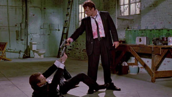
At the risk of committing sacrilege, it has to be said that Quentin Tarantino's directorial debut Reservoir Dogs, for all of its many brilliant merits, is not a good-looking film. Quite the opposite, in fact.
While expertly acted and terrifically edited for maximum impact, the film's overall presentation is flatly lit and unremarkable - and better still, intentionally so.
Tarantino has reiterated over the years that he styled Reservoir Dogs as an homage to 1970s exploitation films, and so the film's dominating muddy-grey aesthetic is entirely appropriate in how thoroughly unfussed it is.
Tarantino and cinematographer Andrzej Sekuła have gone into extensive detail about the film's tricky, budget-conscious shoot, but ultimately the scuzziness only made Reservoir Dogs that much more of a scrappy, ferocious debut from a hungry filmmaker.
6. The Wrestler

Darren Aronofsky's mesmerising drama The Wrestler is wholly concerned with immersing the audience in the life of downtrodden pro-wrestler Randy "The Ram" Robinson (Mickey Rourke).
In addition to Rourke's brilliantly self-reflexive performance, the film is enlivened by Maryse Alberti's grainy Super 16mm cinematography.
Though this results in the film lacking any sort of visual polish or cleanliness whatsoever, it does lend The Wrestler an uncommon grittiness appropriate for the story's many trips to dive bars, seedy strip clubs, and barely-attended wrestling shows.
While few would call it an example of state-of-the-art filmmaking craft, it is entirely effective at reflecting Randy's tawdry existence and evoking that slice-of-life vibe Aronofsky was clearly aiming for.
5. Man On Fire
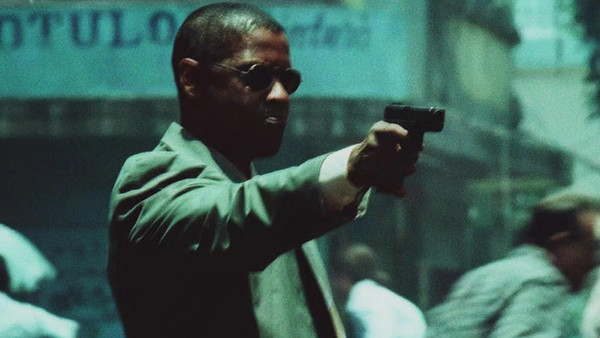
Though the latter half of Tony Scott's filmography is largely remembered for its hyperactive "MTV-style" visuals - characterised by over-saturated colour grading, shaky cam, and frantic editing - it's a technique which Scott both debuted and perfected in his criminally underrated 2004 thriller Man on Fire.
The film is focused on the efforts of alcoholic, world-weary mercenary-turned-bodyguard John Creasy (Denzel Washington) to rescue nine-year-old Pita Ramos (Dakota Fanning) from kidnappers.
The movie's entire visual design is intended to reflect Creasy's own fractured mental state, envisioned here through its sickeningly rich colour palette, jarringly erratic editing choices, and frequent use of double exposure photography to make the image "ghost."
Better still, the utter visual chaos Scott splashes on screen for 146 action-packed minutes reflects the film's own anxiety-soaked setting, taking place as it does within an especially violent area of Mexico City.
You might not like Scott's approach, but it's another great example of daring visuals supporting a film's themes and character work exceptionally well.
4. The Texas Chainsaw Massacre

The Texas Chainsaw Massacre is the quintessential movie that makes you want to shower immediately after watching it. Tobe Hooper's gloriously grungy horror masterpiece wouldn't be nearly as effective and atmospheric as it is without his decision to shoot the film on 16mm film stock.
Though many of the production decisions were largely a result of the low budget, Hooper consciously chose to shoot on a grainy, high-speed film stock which ultimately gave the film its unique home video-style vibe.
Even in its most depraved moments, it feels like we're watching something real that we absolutely shouldn't be: you can practically smell the rotting meat and dried blood coming off the screen.
Sadly every subsequent film in the series opted for a far glossier visual style which, unsurprisingly, failed to yield the same immersively disgusting results.
3. Spotlight

Biographical drama Spotlight may well be the most visually unremarkable film to ever win the Best Picture Oscar, yet that was also entirely by design on the part of director Tom McCarthy.
Spotlight dramatises The Boston Globe's investigations into child sexual abuse by Roman Catholic priests in the Boston area, and is effectively shot to be as unobtrusive as possible.
Given the severity of the film's ripped-from-the-headlines story, McCarthy clearly designed the visuals to resemble "real life" as closely as possible: flat lighting, a washed-out colour grade, and totally unimaginative handheld camerawork.
This helps give Spotlight a docu-drama feel and allows the audience to focus entirely on the actors and what they're saying at all times.
It also helps prevent the film's salacious story from feeling heightened in any way: the mundanity of the visuals keep it grounded in even its more dramatic moments, confirming that the very banality of evil is what allowed the abuse to happen for so long.
Sure, it meant that Spotlight didn't end up nominated for a Best Cinematography Oscar, but the trade-off is that it successfully funnelled viewer attention in all the right places.
2. 28 Days Later

Taking a cursory glance at Danny Boyle's hit horror film 28 Days Later, you'd be forgiven for assuming it was a micro-budget feature, considering that large portions of the movie were shot on prosumer-grade DV cameras and as such lacked the cinematic gloss of film.
But in actual fact, 28 Days Later cost £8 million, and given that Boyle had numerous hit films under his belt before shooting began, this was actually an intentional choice on his part.
Boyle was keen to experiment with digital filmmaking, resulting in a film which, while still impeccably lit and framed by veteran DP Anthony Dod Mantle, has an unmistakable early 2000s digital murkiness about it.
It's as though every shot has been wrapped in a roll of cling film, and yet it is entirely effective in accentuating the movie's highly plausible post-apocalyptic atmosphere.
It just goes to show that with a world-class filmmaker, a great script, and a killer cast, the visual delivery medium isn't quite so important.
1. Gummo
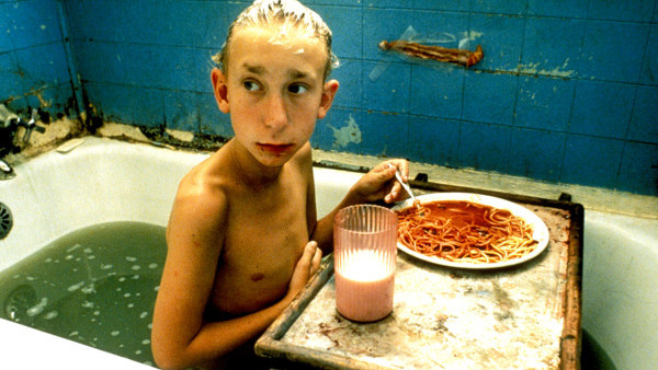
Harmony Korine's cult classic Gummo is a movie that takes every provision possible to make the audience uncomfortable, as perhaps best defined by its general kitchen sink aesthetic.
Now in terms of pure cinematography, Jean-Yves Escoffier's work on the film meets every basic requirement of professional-level lighting and framing, but Korine ensures to fill almost every shot of the movie with visually discomforting imagery.
Whether it's the sickly colour palette, the jarring mixture of film stocks, or the nauseating simplicity of a boy sat in a filthy tub eating spaghetti and chugging down milk, Gummo is a rare skin-crawler of a film that's all the better for how unapologetically hideous it looks.
Given the film's depiction of lower-class nihilism in midwestern America, it's all too apt that the visuals are so convincingly, stomach-churningly low-rent.