10 Modern Movie Poster Trends That Need To Die
9. Don't Turn Your Back On Me

Boy, don’t these fellas look mysterious/heroic/strong?
This is perhaps one of the most overused design tropes in all of entertainment, having crossed over into TV and video game marketing without much alteration. If you walk into your nearest cinema right now, the chances are pretty high that you’ll see at least one poster depicting an angry man with his back turned to his audience.
In examples like The Raid and Battle: LA, we’re supposed to be in awe of the adversity ahead, and pay our respects to the small but brave man about to overcome it. With Agent 47 and The Dark Knight, we are intended to treat the subject with hostility or suspicion – it’s all about angles and body language. This can make for some striking and effective imagery at times (something doesn’t become a cliché for no reason), but it also means the market is completely saturated with cookie-cutter designs created to provoke a feeling of foreboding in the viewer.
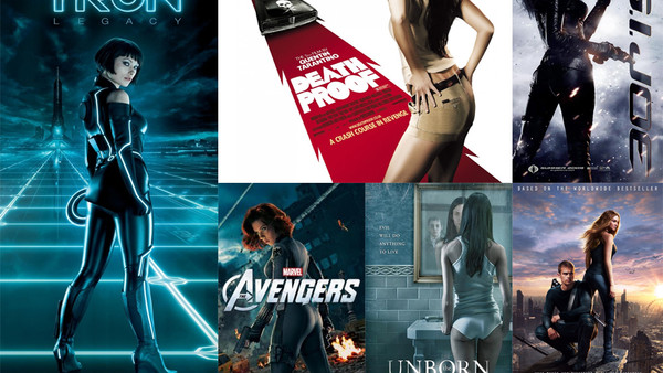
As three of the above posters belong to Christopher Nolan (Dunkirk, The Dark Knight, Inception), it’s not hard to guess what he determines to be his stars’ best angle. Still, he gets more points for originality than a lot of his fellow helmsmen. On the subject of terrible poster tropes, consider how the same shots/angles are typically used for female characters:
