12 Fan Character Designs Better Than What We Got
Sometimes the fans know best.
First impressions count for a lot in life, and that's perhaps no truer than in Hollywood. If a first trailer or, hell, a first image doesn't fly with the fans, it can require a miraculous feat from the studio to turn things around, as history has proven so many times.
There's no denying that a ton of thought and effort goes into even the most terribly designed character in a tentpole movie, but in the case of these films, they didn't just disappoint the fans with their lacklustre designs - the fans actually did it better.
It's fair to say that a lot of fan-created re-designs are excessive, but these 12 enterprising artists and Photoshop wizards worked their magic by taking some fairly unremarkable - and yes, occasionally awful - final designs and brilliantly reinventing them.
Of course, the not-so-great design that made it into the movie can never be undone, but these wonderful alternatives at least make it clear that far more practical, aesthetically appealing and straight-up crowd-pleasing designs were possible. And in some cases, all it required was a few easy tweaks...
12. Cyborg (Justice League)
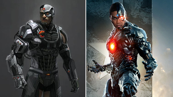
Though the DCEU has played host to its fair share of calamitous character designs, by far the most unpopular on the superhero side of things is that of Cyborg (Ray Fisher).
If it wasn't bad enough that this version of the cult hero was rendered almost entirely in ghastly, unconvincing CGI, the bulky metal exterior felt like over-design for no sake but its own, having little practical purpose and simply being aesthetically ugly.
This nifty re-design from artist Lewis Fischer, however, does away with all of these issues, switching out most of Cyborg's metal armour for a tactical sneaking suit that could be achieved practically, combined with metal components which would require only minor CGI touch-ups at most.
Above all else the practical focus would allow a more believable symbiosis of man and hardware, while looking a good deal more sleek and less clumsy. An effortless upgrade, then.
11. The Joker (Suicide Squad)
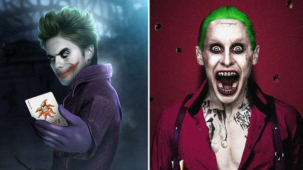
We'll stick with the DCEU for a moment as we consider perhaps the most maligned character design in the entire franchise - that of Jared Leto's Hot Topic-inspired Joker in Suicide Squad.
Whatever you make of Leto's performance, it's easy to see why many found the make-up effects overly loud and obnoxious, to say nothing of his tacky, gangster-inspired clothing which seemed to veer away from the classic conception of the supervillain "just because."
But enter legendary fan artist Bosslogic, who offered up a vastly superior interpretation of Leto as The Joker before cameras had even started rolling on the movie.
This is a case of simplicity proving the key to success - taking Leto's punk-rock persona and melding it with the traditional Joker aesthetic makes for an effortless winner. It's just different enough from previous Jokers, but still recognisably in the same wheelhouse.
10. Michelangelo (Teenage Mutant Ninja Turtles)
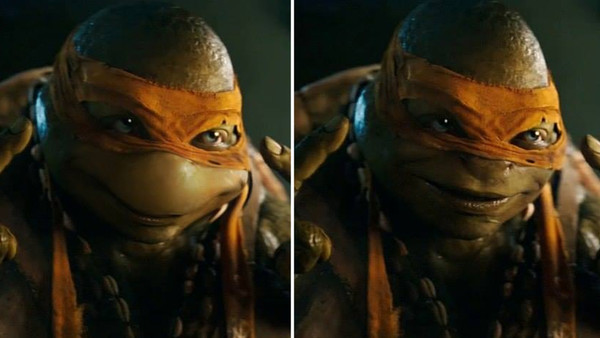
When the first footage of the 2014 Michael Bay-produced Turtles movie was released, fans were immediately horrified at the aesthetic changes made to the iconic heroes in a half-shell.
First and foremost, in order to reflect the film's live-action aesthetic, the CGI Turtles had been designed with more humanoid faces in mind.
But the result of their recognisably human-like eyes, noses and lips was that many fans were left thoroughly creeped out, complaining that the designs wandered too far into uncanny valley territory.
It didn't take long for an anonymous party to "fix" Michelangelo's face, by moving the eyes closer together, removing the nostrils and thinning out the lips. It's a simple fix, albeit one that of course wasn't implemented in the final film.
A more cartoonish look to the heroes certainly would've helped Michelangelo's romantic interest in April (Megan Fox) seem slightly less disturbing, at least.
9. Star-Lord (Guardians Of The Galaxy)
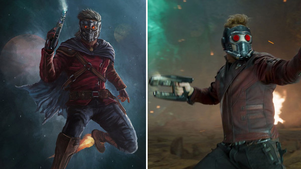
To be clear, Star-Lord's (Chris Pratt) design throughout the Marvel Cinematic Universe has never been less than solid, though it also streamlined and simplified the character's look to the point where it has decidedly less, well, character than in the comics.
But for a slightly more heightened and theatrical revision of the goofball superhero, look no further than the sublime work of Martin Agleron, whose costume is both more comic-accurate and also more indicative of Peter Quill's free-wheeling, often immature nature.
What really sticks out here is the improvised cape, not to mention the series of belts tied around his chest. They certainly help emphasise Star-Lord's seat-of-your-pants heroism above all else.
8. Apocalypse (X-Men: Apocalypse)
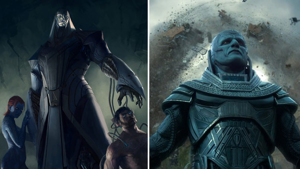
By far one of the most widely-ridiculed supervillain designs of the last few years is Apocalypse (Oscar Isaac) from X-Men: Apocalypse.
Despite the promising casting of Oscar Isaac, the beloved comic book baddie has been compared more to the Power Rangers' Ivan Ooze than his paperback namesake.
Upon release, the film sadly confirmed just how difficult it is to adapt a villain of Apocalypse's stature in 100% practical form with an actual, physical actor.
Isaac failed to bring the requisite menace to the role despite a solid effort, and he just looked far too puny and diminutive to live up to the towering imposition of his comic book equivalent.
Thankfully this wonderful mock-up from Lucas Parolin provides a pretty damn note-perfect rendition of how Apocalypse probably should've looked in the movie.
This is definitely a rare case where it made all the sense in the world to make the character fully CGI and performance-captured - much like the MCU's Thanos (Josh Brolin) - and with the necessary VFX spend, the character could've been realised in all of his colossal glory.
Compare the concept on the left to the Isaac version on the right - the broad shoulders, long limbs and genuinely unsettling, alien countenance make the final movie version look like a guy playing dress-up on Halloween.
7. The Flash (Justice League)
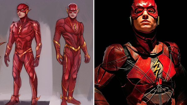
Yet another divisive DCEU design here - as much as Ezra Miller was a bright spot of Justice League, even his most ardent cheerleaders weren't much enamoured with the character's chintzy, angular costume.
As is a common problem with the DCEU, over-design rears its ugly head once again, over-complicating a costume that's stuck to a pretty basic aesthetic through the decades for damn fine reason.
This concept piece from Mona Fuchs performs a simple yet effective re-design, then, by smoothing out the jaggy edges and re-vising the suit to be as sleek and aerodynamic as possible, while a typically heroic - yet not overdone - musculature to boot.
6. Power Rangers (Power Rangers)
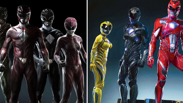
Though 2017's Power Rangers movie actually turned out a pleasant surprise for the most part, the Rangers' new suits are still held by many fans to be a needless feat of overdone re-design.
Clearly, an attempt was made to take the "goofy" morph-suits of the original TV series and make them look edgier and more contemporary.
Despite the understandable decision to re-work them as metallic sneaking battle suits, they're also too visually busy to be much appealing. Also, did we really need such blatant boob armour for the female Rangers?
Thankfully, ludicrously talented concept artist Carlos Dattoli provided his own take, forging something of a compromise between the classic TV suits and the new movie's re-design.
This mock-up basically makes the original suits look far more durable and combat-ready, while refusing to indulge in the excesses of the 2017 movie suits and instead opting for a lean skin-tight look.
Given the "gritty" style of the film, these suits would've been a much better fit than the bright, blocky costumes we ended up with.
5. Emma Frost (X-Men: First Class)
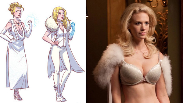
The depiction of comic book villain Emma Frost (January Jones) in X-Men: First Class was, pardon the pun, a bit of a bust.
It wasn't purely down to January Jones' flat, affect-free performance, though, but also some painfully patronising costume design, with Jones' skimpy attire leaving precious little to the imagination while drawing consistent, unfavourable comparisons to Austin Powers' fembots.
Artist Ron Chan managed to give Frost an easy classing-up, by skewing away from her traditionally scantily-clad image in the comics and providing her with an all-white pant-suit.
But crucially, the re-design still looks distinctly like the Emma Frost fans know, with just a little more dignity and a little less male fantasy in mind. Jones' performance still would've sucked, but at least the fembot remarks wouldn't feel quite so spot on.
4. General Grievous (Star Wars: Episode III – Revenge of the Sith)
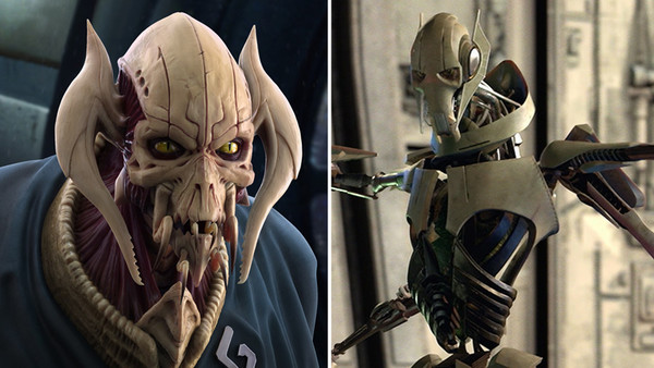
It's certainly fair to say that General Grievous is one of the more memorable antagonists of the Star Wars prequels, though the character's menacing potential is also fatally undercut by George Lucas' needless de-toothing of the character - that is, making him a fatally flawed hybrid of cybernetic parts and organic organs.
But this fantastic re-design from Mikhail Akimenko opts to make Grievous more viscerally offputting by rendering him as an entirely organic alien entity.
This design largely maintains Grievous' original design but reinterprets it through skin and bone, which is ultimately a lot less silly and a whole lot more intimidating.
Granted, Lucas was likely thinking about selling lunchboxes when he came up with the final Grievous design, but this new look fully lives up to the fear factor implied by his awesome title.
3. Sonic (Sonic The Hedgehog)
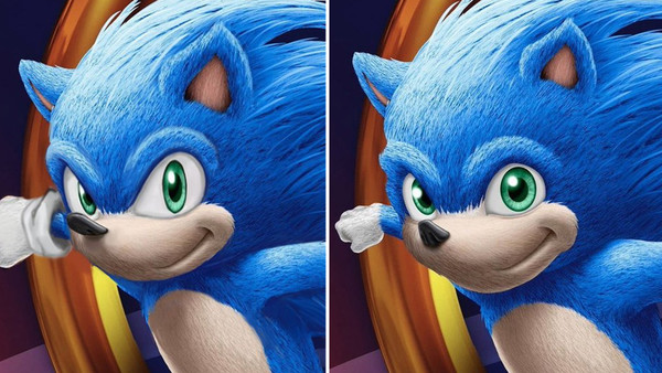
Though the first trailer for Paramount's upcoming live-action Sonic the Hedgehog movie hasn't yet been unveiled, fans were afforded their first look at what the iconic platformer would look like through recent images leaked from the film's style guide.
And, uh, the results aren't pretty.
Thankfully an enterprising fan decided to re-edit the design to more closely resemble the video game equivalent, and it looks effortlessly superior.
Between Sonic's eyes being enlarged, his pupils squashed and his nose elongated, it's a relatively simple series of edits that nevertheless prove so much more crowd-pleasing.
Sadly, with the film already deep into post-production, there's zero chance of the design being changed before release. Still, #NotOurSonic.
2. Scarlet Witch (Avengers: Age Of Ultron)
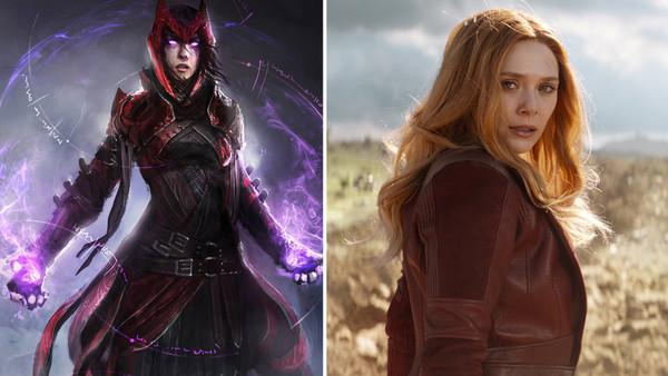
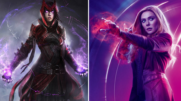
As talented an actress as Elizabeth Olsen is, it's always been a bit of a shame that her Scarlet Witch has been forced into a number of costumes either totally unremarkable or simply designed to emphasise her physical attributes.
Her first costume in Avengers: Age of Ultron was a fairly forgettable combination of black dress and red jacket, which by the end of the movie was switched out for a cleavage-heavy corset that even Olsen herself complained about.
But this excellent re-design by Daniel Kamarudin solves both of the character's design problems in the MCU: it keeps her modestly dressed while adopting a style that feels a little more obviously inspired by her comic look (sans the fully-flaunted skin).
With its abundance of belts it certainly walks a fine line between being over-designed and just chaotic enough to reflect Wanda Maximoff's character. She is a witch, after all.
1. Superman (Justice League)
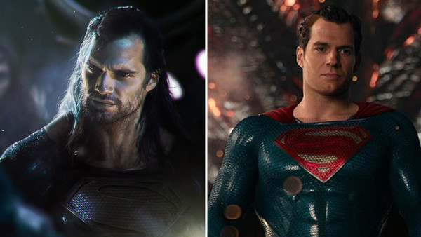
It's fair to say that Superman's (Henry Cavill) appearance in Justice League is just an all-around mess.
Due to moustache-related issues, Henry Cavill's mug frequently looks like it's hanging on with digital gaffer tape, and despite Cavill making an incredibly blatant tease about the Man of Steel donning his iconic black Superman suit post-resurrection, it ultimately never happens (though is hinted at in a deleted scene).
The tease was taken seriously enough by fans that some artists mocked up their own visions of what a reborn, monochrome Superman might look like.
And none did it better than George Evangelista, by not only expertly Photoshopping Henry Cavill into the iconic black suit from the comics, but even giving him the long hair and scuzzy beard often associated with his resurrected character.
While nobody's saying Cavill needed to sport the hairy, grizzled look for future Superman movies, it could've been an awesome, shocking moment at the end of Justice League, while also avoiding the whole kerfuffle with Warner Bros. spending millions of dollars to digitally "shave" his face.
The results couldn't have been any worse than what we got, right?