Are Spider-Man: Homecoming And Transformers: The Last Knight Posters The Worst Ever?
Never, ever let the interns loose on Photoshop.
It shouldn't be up to fans to have to make great movie posters on behalf of studios. They should plough some of the millions of dollars they set aside for marketing into making one sheets that fans will want to have on their bedroom walls as works of art. That always used to be the case, anyway.
Now though, there seems to be a horribly virulent strain of marketing that sees anyone with half a day's experience on Photoshop or Microsoft Pain given the task of slapping something together half-heartedly. And unfortunately, since all the young folk seem to be drinking endless litres of dazzling energy drinks, the results tend to be both terrible and disgustingly hyperactive. You can almost smell the sugar crash on them.
The two worst culprits this year have come courtesy of two studios who should know better, and are dedicated to franchises that are so bullet-proof that the sloppiness just looks like cynical apathy. Or some sort of prank meant to prove that they can make a billion dollars even while consciously unadvertising their films.
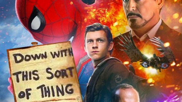
Those two, of course, belong to Spider-Man: Homecoming - whose latest poster looks like the cover of a boot leg DVD found on a market stall three days after the movie's cinematic release - and Transformers: The Last Knight, which shows similar aesthetic contempt.
Would you really even consider putting either of these monstrosities on your wall?
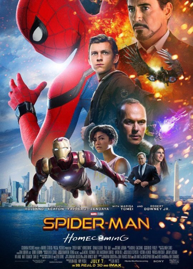
It used to be that posters would either be visually dazzling, taking a minimalist approach to selling a certain aspect of the movie, or they'd at least try and tell a story in their images. This is basically a condensced IMDB cast-list.
And why isn't it just Spider-Man? The other posters showing him hanging around on the New York skyline are masterpieces compared to this.
And then there's Transformers...
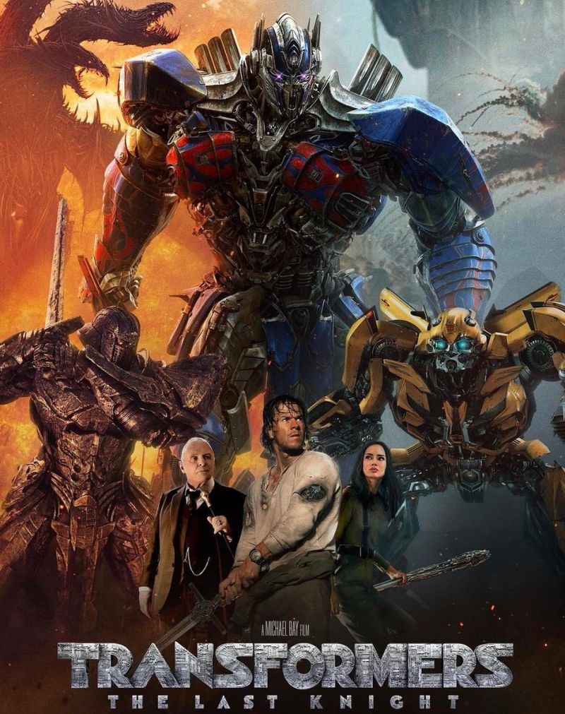
Again, there's no attempt to tell a story. It's more like a hyperactive mood board, as if the studio thinks that its audience will only respond to being bombarded with the visual equivalent of a pick 'n mix.
And there are a couple of things very clear: firstly, whoever cut Mark Wahlberg out doesn't know how to cut people out of images properly, and there's no way Laura Haddock has even seen that weapon she's supposed to be holding.
None of these problems are entirely unavoidable, and releasing posters that look amateurish and unfinished is absolutely unforgivable. But then, they're going to make all the money anyway, so why the hell should they even care?