Dumbo Review: 5 Ups & 5 Downs
Downs...
5. Tim Burton's Sloppy Direction

Tim Burton is one of the most inconsistent filmmakers working today, and it's never really clear whether or not we're going to get the Edward Scissorhands Burton or, uh, the Dark Shadows one.
Sadly Dumbo gives us a Burton closer to the latter. That is to say, there are depressingly few hallmarks here of the director who has given audiences so many stylish and iconic classics over the years.
Despite being a veteran filmmaker, Burton opts to rush through many of the movie's most potential-filled moments, especially Dumbo's initial flight sequence and also the baby elephant eventually realising that he doesn't need a feather in order to fly.
Burton of all directors should've been able to milk these beats for every emotional drop, and yet, the end result often feels bizarrely workmanlike.
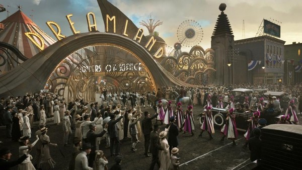
That's to say nothing of the excessive visual effects in the second half of the movie, where V.A. Vandevere's (Keaton) Dreamland amusement park is rendered plastic and unconvincing, as the digital elements blend quite horribly with the on-set ones.
Somebody somewhere will probably argue that this was Burton's deliberate attempt to highlight the hollow falseness of Vandervere's business, but it ultimately just ends up looking rather ugly.
Given that Burton's sleek style is so often his strongest asset, that's pretty disappointing.