Fantastic Four Concept Art Reveals A Totally Different Thing And A Much More Faithful Doom

Would this have made the movie good?

The Thing with ability to change back and forth from rock at will? Doom in his monarchistic armour? This is the art of Dave Raposa, a concept artist who worked with 20th Century Fox in 2014 to come up with poster designs for their then in-production Fantastic Four. As you can probably tell, whatever movie is being represented here in these posters is a far cry from the jumbled mess that we actually received. Raposa apparently began to hear more and more about the film as he continued to work, which is why the costumes and looks on display here aren't indicative of the final film. It's a shame that some studio head somewhere thinks that this look for Doom isn't right, because it's a damn sight better than whatever the hell that was they cooked up in last year's box office bomb. io9 have spoken with Raposa about the concept art, which revealed some interesting insights into his design process:
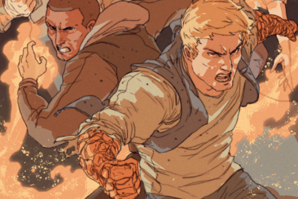
"The first thing I really wanted to focus on, outside of the single character shots, was the team coming at us as a unit. I never liked when teams of characters like this seemed to function as individual heroes in movies, doing their own thing, so I wanted to make the compositions seem like they were flowing together... I tried to make them feel like they were mixing together as they rushed forward at the viewer, as a team.€
It's a shame that the studio didn't go with Raposa's art, as it's definitely a lot more agreeable than the moody, photoshop-heavy posters that ended up in multiplexes. To be honest, it's just a shame that the movie sucked as much as it did. Talk about wasted potential.
Contributor

Cinephile since 1993, aged 4, when he saw his very first film in the cinema - Jurassic Park - which is also evidence of damn fine parenting. World champion at Six Degrees of Separation. Lender of DVDs to cheap mates. Connoisseur of Marvel Comics and its Cinematic Universe.