Mulan Review: 6 Ups & 4 Downs
Downs...
4. The Inconsistent Visuals

Though it's clear throughout Mulan that a pretty penny was spent on its production - a stonking $200 million, in fact - it also has to be said that the end result is a little spottier than you'd hope for from such a handsomely-priced movie.
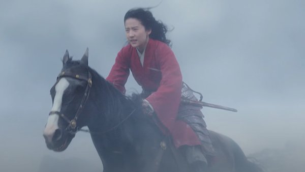
Though the sets, costumes, natural locations, cinematography, and general production design are all frequently gorgeous, much like Guy Ritchie's Aladdin the overall aesthetic is wildly inconsistent.
It is a film that at once looks both expensive and cheap, at times resembling a mega-budget wuxia movie and at others a kitchen sink attempt at an historical epic.
The worst offender style-wise is without question the visual effects, which while often beautiful and convincing, frequently devolve into muddy, blurry ugliness, especially during an avalanche sequence in the second half of the film.
For every sumptuous shot filmed by director Niki Caro (Whale Rider), there tends to be one that looks bafflingly cheap or even corny, which for a film of this scale is a bit disappointing.