Star Wars: The Force Awakens Used The Wrong Font In Its Opening Crawl
That's not how the font works!
Turns out there was one mistake in Star Wars: The Force Awakens that everyone (well, most people) missed.
The film has become one of the biggest of all time, grossing over $2bn at the box-office, and since then there have been countless articles written, theories devised, and mistakes spotted. Now, months after its release, it's been revealed that the font used for the opening crawl was wrong.
That's it, Disney - give back all the money, burn all the DVDs, shut down production on Episode VIII. This is an outrage.
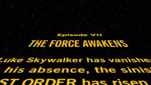
A post on Medium by Fixthecrawl was the first place to note the error (as noted by SlashFilm), pointing out the the original trilogy used Univers, Ultra Condensed for the episode titles, and then News Gothic for the main body of text. However, on The Force Awakens, the title is in a condensed version of News Gothic. Cue shocks from font fans all around the world:
News Gothic (also used for the body text) is very round, friendly, and readable, whereas Univers gives the title of the film some stately heft telegraphing the impression that the events about to transpire are carved in the stone of destiny (or something). Its subtle, but noticable. The S and R glyphs, in particular, are very different. Overall, its boxier, and feels more staid. Less urgent.
It might not seem like a big deal, and it doesn't really alter your enjoyment of the film, but the opening crawl is an iconic part of Star Wars, and one of the most instantly recognisable hallmarks of the saga. Speaking on the Electric Shadow podcast, Dan Perri, who designed the opening titles on the original movies, was shocked to find out the font was wrong:
"Oh my God, thats way off. I know the New Gothic lines well and I can tell you I used it on Raging Bull because it was from the era, from the 40s and 50s. No I would not have used New Gothic on Star Wars."
Given how much The Force Awakens paid homage to the original movies, in particular A New Hope, and how big a fan J.J. Abrams is (as well as being a self-professed font geek), it is strange that this happened, although it is something they were aware of, as acknowledged by Pablo Hidalgo, head of the Lucasfilm Story Group:
So, there you have it. Even by Star Wars standards it's incredibly nerdy, but what do you think - does it matter? Should the font be replaced for Episode VIII? Are we all going to have an even bigger 'controversy' if/when Rogue One doesn't even have an opening crawl? Are we all going crazy from Star Wars withdrawal? Sound off in the comments, in whatever font you like.