The First Purge Review: 2 Ups & 7 Downs
4. The Visually Sloppy Action Sequences

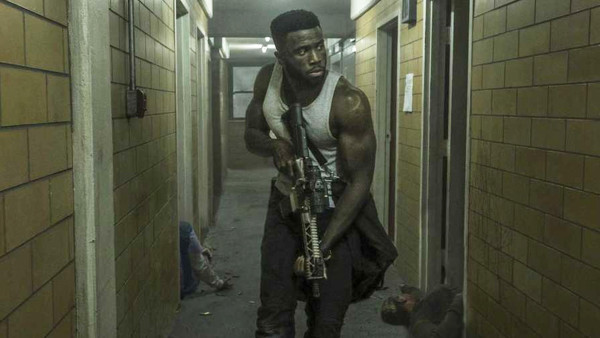
In addition to the low-rent production, the actual set-pieces themselves are disappointingly messy, though this doesn't really seem to be a result of the budgetary constraints given that the last two movies delivered thrilling action at lower price points.
The main problem is Gerard McMurray's slapdash direction: most of the close combat fighting is spasmodically shot and edited for maximum confusion. It's a frequent headache trying to have even a basic idea of what's going on, such that looking for clear spatial awareness of how a fight's unfolding quickly becomes a fool's errand.
This culminates in a visually irritating finale, in which a repeatedly flashing light is needlessly thrown into the mix, turning an otherwise mildly entertaining showdown into an actual eyesore.