The Grudge Review: 2 Ups & 8 Downs
5. The Ugly, Flat Cinematography

Considering how utterly ravishing Pesce's debut was, it's a real shame that his first major studio movie is so utterly hideous from a visual perspective.
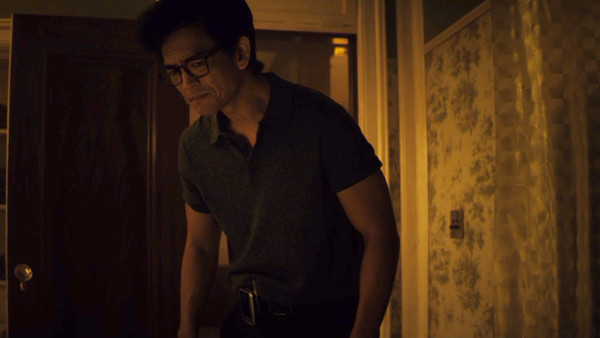
From the first scene alone, it's clear that most all colour and vitality has been stripped out of the film, creating a washed-out, dull aesthetic which does nothing to make the airless narrative any more interesting.
But the weirdest decision has to be the odd yellow tint applied to the vast majority of the movie.
While it gives the film a vaguely distinctive look from its genre competition, it's extremely unappealing to look at for prolonged periods, and not in the way Pesce likely intended.
Whether this is the fault of cinematographer Zack Galler or an ill-advised choice made in post-production, The Grudge is one of the ugliest studio horror films to get a theatrical release in recent memory.