The first interaction we have with a video game is with its case and the artwork which has been chosen to represent the game. For a title to be commercially successful it needs a cover which is going to stand out on store shelves, grab our attention and have us willing to part with our hard-earned cash. From a young age were told to never judge a book by its cover. Lets be honest though its impossible to look at a video game and not form a judgement based on the artwork. Often its not even a bad way of evaluating a game. Of course there is occasionally a terrible game which comes out with an awesome cover but for the most part the artistry and awesomeness of an effective piece of cover artwork is typical of the entire gaming package. Some successful covers are daringly controversial while others are so overflowing with vibrant colours that its impossible not to warm to them as with any artwork, theres really no hard-and-fast rule as to what makes a good game cover. From images of severed hands floating through space to games which have the instructions manual cleverly incorporated into the cover, over the years weve seen some truly incredible pieces of cover artwork which have ingrained themselves onto our memories. Here are 17 of the best ever:
17.Uncharted 2: Among Thieves (2009)
Why It's Great: It may not have the same unintentionally comedic impact as the game's Japanese artwork (see below) but overall it is the game's western cover which is the most effective. The sight of Nathan Drake being fingertips away from plummeting to his doom looks incredible. The entire treasure-hunting series is known for its excellent cover artwork, but it is Among Thieves, which depicts the hero in this perilous situation, which is by far the most effective. The sight of the statue sneering at Drake's plight in the background is also extremely creepy. How It Represents The Game: Aside from it's absorbing shooting mechanics the gameplay of the Uncharted series is based around climbing up ancient buildings and clambering your way out of wreckages (which seem to follow Drake like a bad smell). This cover not only encapsulates the importance of climbing in the game but also tells of its cinematic nature. Playing Among Thieves is like watching a great action film, littered with memorable set-piece moments. What is more cinematic than seeing a character hanging on to something for dear life?
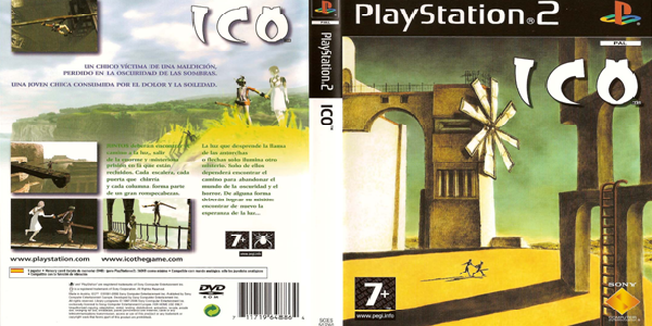
16. Ico (2001)
Why It's Great: Any art history buffs will immediately recognise that Ico's superb cover is based on the surrealist painter Giorgio de Chirico's The Nostalgia of the Infinite. De Chirico is known for painting when psychoanalysis was an emerging theory, influencing him to transfer his subconscious landscapes and dreams onto the canvas. Ico's cover has an incredible quality where you feel like you're peering into someone's dreams. Anyone who played the amazing game all those years ago will definitely feel strong pangs of nostalgia as they look at this classic cover. How It Represents The Game: The artistic influences Ico's cover draws on reflects the experience of playing the game. The game's director Fumito Ueda purposely allowed the classic platform game to finish with a vague, ambiguous ending where it was unclear if Yorda was alive, if she traveled with Ico or if the whole experience was the protagonist's dream. Icos cover which is after all the first part of the game you interact with certainly suggests that everything could be a dream.
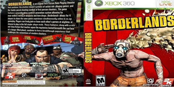
15. Borderlands (2009)
Why It's Great: Released around the same time as Halo 3: ODST and Call of Duty: Modern Warfare 2, Borderlands had to find a way of garnering the attention of buyers who would normally default to purchasing the more tried and tested first person shooters. Gearbox Software would do this by using an eye-catching, controversial box cover to get the game noticed. The cover sends forth the unambiguous message that the RPG-shooter is going to blow your mind; anyone who played Borderlands will know that it delivers on this lofty promise. The decision to not feature the playable character on the front cover was an excellent one as using a bandit allowed Borderlands to have a less conventional piece of artwork. How It Represents The Game: Compared to the likes of Skyrim and Fallout 3, Borderlands is an off-the-wall experience where the greed of those on the planet of Pandora quickly leads into madness. The image of the bandit pretending to blast his brains out is certainly typical of the crazy, unforgettable experience of Borderlands. The games cel-shaded style inspired by Ben Hibons short film Codehunters is also reflected in the box cover.
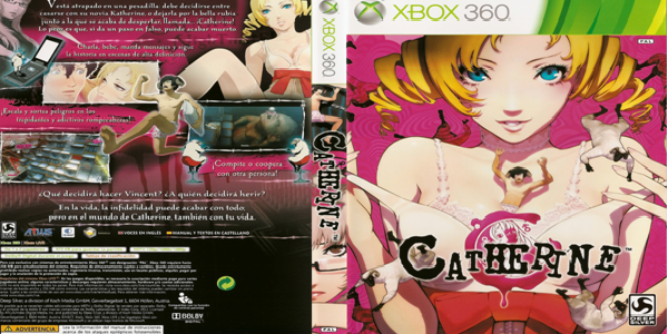
14. Catherine (2011)
Why It's Great: Easily one of the wackiest covers in the long history of box artwork, if ever there was a box which left you curious as to what on earth the game is about, it's the cover for Catherine. Pictured on the front is the 22-year-old beauty, Catherine, suggestively taking off her top. The cover also depicts humanoid sheep hurtling towards the ground like rain, leaving you clueless as to what is going on until you play the game. Weird though it may be, it certainly grabs your attention. How It Represents The Game: The presentation of Vincent being dwarfed by Catherine is very fitting as the protagonist finds himself in the clutches of forces completely outside his control, spearheaded by the young woman who attempts to seduce him every night. Though the game deals with themes like sexuality and fidelity, everything is always fairly comic with some dark undertones and this is captured by the wackiness of the cover. The image of Katherine, Vincent's girlfriend, staring austerely over her glasses on the game's spine hints at the darker elements.
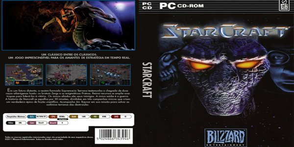
13. StarCraft (1998)
Why It's Great: The orange glow of the Protoss' eyes makes it difficult to look away from the cover of what is easily the most important real time strategy game ever made. The alien being is sandwiched between a human and a Zerg Hydralisk. It's beneficial to the cover's effectiveness that the human isn't the main subject matter when all is said and done, aliens are so much more awesome. How It Represents The Game: The main reason why StarCraft is so much better than the strategy games which had preceded it is because it featured three completely unique playable factions. Prior to the release of StarCraft, RTS games had always featured armies which looked ever-so-slightly different to one another but which were identical to play as. StarCraft's cover makes it clear that the game's biggest selling point is its three incredible races, with each of the three figures representing their faction on the cover. Each army have their own strengths, weaknesses and motives. For example, the Protoss are costly and extremely powerful while the Zerg are cheap but can be used to swamp an opponent.
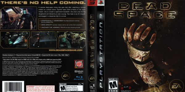
12. Dead Space (2008)
Why It's Great: There's something oddly captivating about seeing a severed arm floating through space. It's something which is appalling but which we can't take our eyes off of. Dead Space's cover is incredibly dark but it achieves this effect without revealing the identity of the sinister beings which have severed this arm namely the Necromorphs. In this way the cover is both horrifying and mysterious; what a feat in box art! How It Represents The Game: When it was released Dead Space felt like the first game in years to have properly made a return to survival-horror principles. The games protagonist, Isaac, was isolated, ammo supplies were scarce and the enemies were utterly terrifying. Dead Spaces cover announces the fact that the game contained within is going to be one of the darkest, most intensely unsettling experiences youve had for years. The literal blackness of the cover is also indicative of how shadowy the gaming experience is, with Isaac venturing into the depths of the overrun USG Ishimura and its many, dimly-lit corridors. Cutting off limbs is a huge part of the gameplay so it is fitting that it is represented on the front cover.
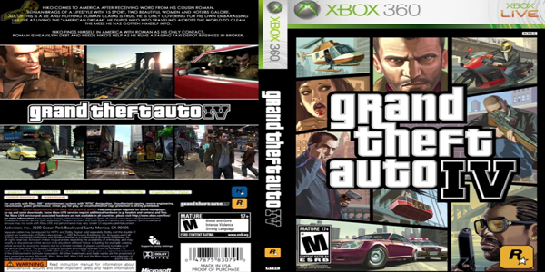
11. Grand Theft Auto IV (2008)
Why It's Great: What would a list of the best video game covers be without a GTA title? Since the release of GTA III back in 2001 the series has utilised the iconic paneling style to depict various examples of the crime, corruption and excess which define the franchise. It can be difficult to conclusively say which cover is the best, though we tend to favour the ultra-stylish GTA IV artwork. You might never meet the woman with the lollipop but each of the panels have their own stories to tell about Liberty City. How It Represents The Game: Niko's panel is fittingly the focal point of the cover. The man who unwillingly finds himself at the centre of all the city's violence and conflict is also bang in the middle of the cover, surrounded by various criminals packing guns. The protagonist may have come to America looking to make a better life for himself legally but this doesnt mean hell submit to any of Liberty Citys many thugs, documented by his intense glare on the cover.
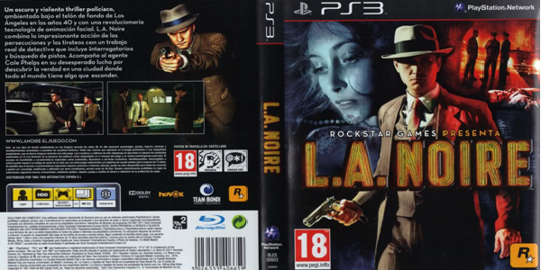
10. L.A. Noire (1996)
Why It's Great:
Its not often that the cover of a video game could easily be mistaken for a promotional poster for a film. LA Noires cover looks like its come straight from Hollywood and will be gracing billboards and buses all over the world. Youd be forgiven for thinking Cole Phelps was an actor who had been retouched to the point of oblivion. No other video game cover has been quite as Hollywood as L.A. Noire.
How It Represents The Game:
The game itself plays out like a movie and is very focused on narrative. Cole Phelps, the obvious star from the cover, is also developed very deeply as a character through flashbacks and gameplay. The use of red and blue hues for the images in the background mirror the flashing lights atop police cars while the colours also represent the themes of the game. The red part of the background showing police investigating a murder gives off a sense of danger while the blue, showing a woman, seems to represent Phelps love life - cold and aloof.
9. Resident Evil (1996)
Why It's Great: Surely it is all but impossible to see the video game with this cover and not be want to play it? From Chris Redfield's vein-ridden forearms to the massive shotgun he's packing, this is the sort of memorable box art which makes you want to take control of the character. It's no wonder that Resident Evil launched a franchise with this cover compare it to dull, forgettable Resident Evil 6 cover and you see why the series has diminished in quality so much. How It Represents The Game: It might not actually feature any zombies but the cover still reflects the fact that Resident Evil was one of the most terrifying games ever when it was released nearly two decades ago. The horror-stricken look on Chris' face (which incidentally looks a lot like Evil Dead's Ash Williams) makes it clear that the game will feature some horrifying opponents which make the spiders on the cover look tame.
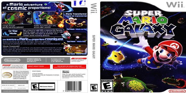
8. Super Mario Galaxy (2007)
Why It's Great: Mario debuted on the Nintendo Wii in what would be one of the best games in the console's entire life-cycle. Bursting with colour and vibrancy, Super Mario Galaxy also boasts an incredibly visually appealing cover loved by both adults and children alike. There is something comforting about examining the bright artwork it could be the nostalgic appeal of such an important character in video gaming history or perhaps the fact that there is no visible threat other than the black hole in the bottom right corner. How It Represents The Game: Super Mario is a series which has, over the years, come to be defined by its bright landscapes and inviting worlds. The ability to travel through space and encounter so many worlds means that Super Mario Galaxy features an even more diverse array of environments than other Mario games. The game's cover certainly captures this as we see Mario leaping from one world to another, followed by a trail of stardust.
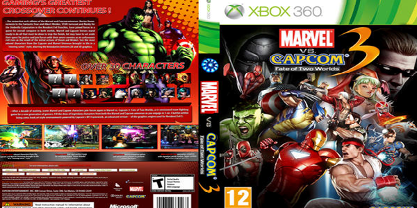
7. Marvel VS. Capcom 3 (2011)
Why It's Great: There's so much going on in the cover of Marvel vs. Capcom 3 that it can be difficult to know where to look first. Do you focus on the Hulk letting out a bellow of rage or Albert Wesker looking suave in the top corner? Is the battle between Iron Man and Ryu the most interesting or do you look at Wolverine about to plunge his adamantium claws into someone's face? Things may be a little congested but they're most definitely amazing. How It Represents The Game: The hectic cover perfectly represents the crazy, manic fighting of the Marvel vs. Capcom franchise. One of the selling points of Marvel vs. Capcom 3 was the huge roster of playable characters so it makes sense for the case artwork to be covered in the fighters. It would have been nice for Thor to get some love on the front cover, particularly with the original film about the Norse god opening just one month after the game's release.
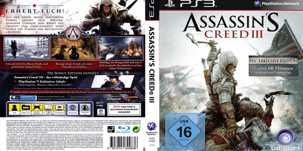
6. Assassin's Creed 3 (2012)
Why It's Great: Assassin's Creed III will likely not be remembered as the finest game in the long running Templar-killing series with the tailing and eavesdropping missions partially undermining the gripping narrative, incredible visuals, naval missions and hunting mechanics. However, the game's cover is by far the best in the series. All of the Assassin's Creed covers are visually linked by their white backgrounds and the depiction of a hooded assassin. Assassin's Creed III's cover is the best as where the others encapsulate the importance of stealth it is the only cover which depicts action. We see Connor about to bed his tomahawk in the head of a luckless British Redcoat. How It Represents The Game: The other covers had never acknowledged that the best thing about Assassin's Creed is the ability to kill historical bad guys with brutal efficiency. Of course stealth mechanics have their place but it seems obvious that assassinations should be the part of the game to be depicted on the cover. Assassin's Creed III is the first and only title in the series to show real action and as such it is the best.
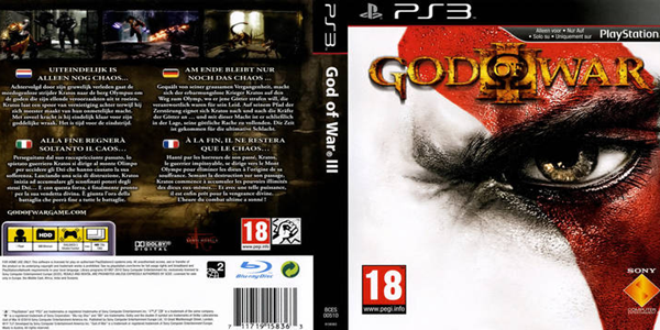
5. God Of War III (2010)
Why It's Great: God of War is not only one of the best series of hack-and-slash games ever made but it also has some of the best covers. The covers of the other games may have rather more going on in them but it is the artwork of God of War III which is the most effective. As you look into the intense stare of Kratos you would be forgiven for thinking that the Ghost of Sparta is the bad guy. It is this terrifying stare which is guaranteed to grab you attention and make the game stand apart from the others on store shelves. How It Represents The Game: Kratos' uncontrollable ferocity is very evident in all of the God of War games. Indeed, the 'hero' must have killed more enemies than any character in the history of video games (normally in extremely graphic fashion). This cover perfectly captures the rage and irrepressible thirst for revenge which defines the character. Some of the other game cases in the series may show cool temples and in the case of the original Medusa's severed head but God of War 3's cover gives amazing insight into the hero's troubled psyche.
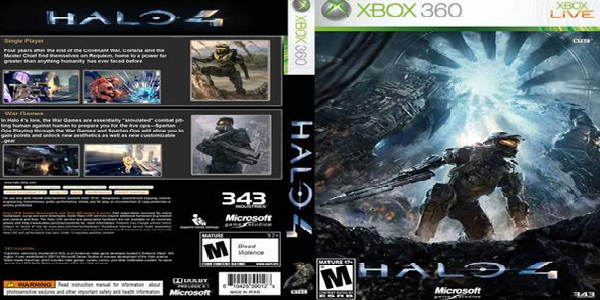
4. Halo 4 (2012)
Why It's Great: The release of Halo 4 was so hotly anticipated that Microsoft had to release a slow drip-feed of information about the game to keep fans satisfied. The game's publisher revealed the game's cover artwork in an incredibly clever way, emailing 32 puzzle-pieces of the cover to 32 of the game's biggest fans. The email's subject was Your Piece of the Halo 4 Puzzle. From here those who had received the email had to pool together their snippets of the image to make a whole. Doubtless when they had finished they were not disappointed as this cover is truly epic. How It Represents The Game: Master Chief has always been a hero who has thrived under inordinate amounts of pressure. The seven foot tall super soldier is nearly always outnumbered and outgunned but still finds a way to succeed and, yet again, save humanity. The fact that the protagonist is depicted on one knee represents the enormity of his task, though as always he is still looking ahead (presumably to his next opponent).
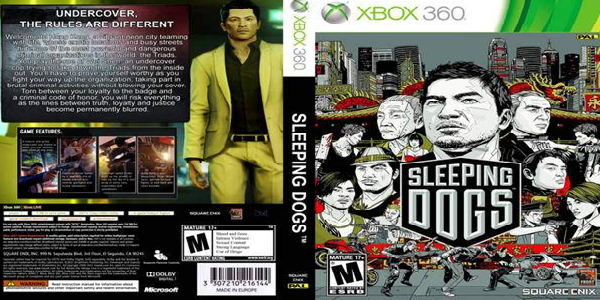
3. Sleeping Dogs (2012)
Why It's Great: Excessively busy, convoluted game covers can definitely be detrimental to the artwork's cause. Attentions can be dragged away from what we're supposed to be looking at and as a result the box can lack visual impact. Sleeping Dogs' case may be crowded but this is why it is so awesome. Wherever you look on the case you see something interesting happening from the gun-wielding Triads to the guy holding a bloody cleaver. How It Represents The Game: When Sleeping Dogs was released it entered the already crowded territory of the open-world crime game, dominated for so many years by GTA. To compete with the giants of the genre Square Enix had to differentiate themselves from GTA on store shelves with the cover. While GTA covers are defined by panels of solid colour, Sleeping Dogs case executed by Tyler Stout shows the characters in black and white. Being the first crime game to be based in the East, it is fitting that Sleeping Dog's artwork should be stylistically original.
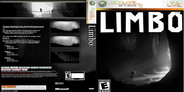
2. Limbo (2010)
Why It's Great: Limbo's visually arresting cover is genius not only does it tell a story but it leaves you with questions which you want answering. Who is the small child? Why are they alone in the dark woods? Where are their parents? It is incredible that such a minimalistic, simple cover can provoke all of these questions. Our desire to find answers also makes us all the more likely to play the eerily dark platformer. How It Represents The Game: Limbo's cover art is some of the least misleading you're ever likely to encounter. The creepy sight of this faceless child wandering into the light is typical of the whole incredibly unsettling game, where you are almost certain to witness the horrific death of the child pictured at least a dozen times. The use of black-and-white tones in the cover runs throughout the gaming experience, with simplicity being used to enhance the eerie atmosphere. Limbo is a title which proves that you don't need advanced graphics and gore to be scary and this is true of the cover as well.
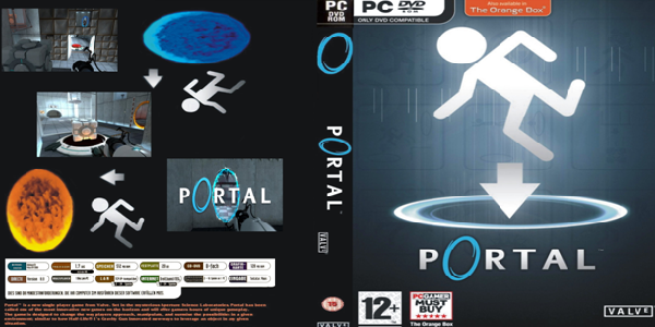
1. Portal (2007)
Why It's Great: The Portal cover proves that the congested, colourful video game covers arent necessarily the most effective. Valves games cover utilises a limited colour palette and an incredibly simple design but is nonetheless the best video game cover of all time. The artwork is basically just a logo on the games box but its beauty is in its simplicity and by extension its ability to be instantly recognised. Portal 2 would also feature a great cover though it was lacked the minimalism of its predecessor, probably because it was marketed as more of a standalone title. How It Represents The Game: One of the best things about Portals cover is that, as simple as the design may be, it practically explains everything you need to know about the revolutionary gameplay. In this way the cover acts not just as the artwork but also as the games instruction manual. Part of the reason why Portal was such an incredible gaming experience was because the gameplay was so simple yet so compelling and the uncomplicated, effortlessly beautiful cover reflects this fact with a restraint never before witnessed in the history of box artwork. So there we have it? Have we missed an exceptional pieces of art? Any box art covers that deserve to be in this list? Let us know in the comments section below.
Hailing from South East London, Sam Heard is an aspiring writer and recent graduate from the University of Warwick. Sam's favourite things include energy drinks, late nights spent watching the UFC with his girlfriend and annihilating his friends at FIFA.
 The first interaction we have with a video game is with its case and the artwork which has been chosen to represent the game. For a title to be commercially successful it needs a cover which is going to stand out on store shelves, grab our attention and have us willing to part with our hard-earned cash. From a young age were told to never judge a book by its cover. Lets be honest though its impossible to look at a video game and not form a judgement based on the artwork. Often its not even a bad way of evaluating a game. Of course there is occasionally a terrible game which comes out with an awesome cover but for the most part the artistry and awesomeness of an effective piece of cover artwork is typical of the entire gaming package. Some successful covers are daringly controversial while others are so overflowing with vibrant colours that its impossible not to warm to them as with any artwork, theres really no hard-and-fast rule as to what makes a good game cover. From images of severed hands floating through space to games which have the instructions manual cleverly incorporated into the cover, over the years weve seen some truly incredible pieces of cover artwork which have ingrained themselves onto our memories. Here are 17 of the best ever: