10 Things Everyone Always Gets Wrong About The Walking Dead
10. "It's An Ugly Show"

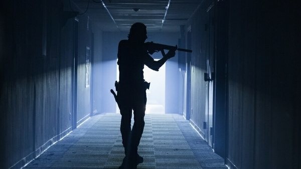
Unlike most other shows on the air, The Walking Dead has always stood out thanks to its unique visual design. Opting for a grittier aesthetic to properly reflect the rough post-apocalyptic wasteland the characters occupy, the programme is photographed on 16mm film rather than with crisp HD digital cameras, giving it a grainy look that, while distinctive, can be a little ugly at times.
Still, although that purposefully rough image doesn't look great when it's blown up on a big-screen TV, the show's cinematography has always been hauntingly beautiful. The director of photography for the first couple of seasons, David Boyd, gave the action a cinematic look despite the low-quality film stock making everything appear as though it had been stamped on, before Michael E. Satrazemis took the reigns to give the show a more expressionistic, darker visual style from season 4 onwards.
For the most part the visuals are supposed to be as natural as possible in order to properly depict a stark, believable dystopia, but that hasn't stopped the show from looking stunning at times, most recently exemplified in the fire-and-brimstone orange and blue used throughout the mid-season finale.