The Umbrella Academy Review: 7 Ups & 2 Downs
3. The Style & Effects

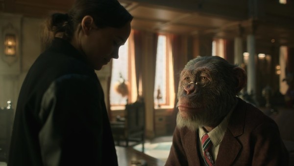
Speaking of Pogo, it's clear that Netflix haven't skimped on the effects budget, because the talking chimp is right up there with the Planet Of The Apes stars for realism. To the point that it's actually pretty scary, in fact.
Beyond him, generally-speaking the effects are great and this doesn't feel like a case of a TV show being chosen as the format for cost considerations alone. It's far above even modern Doctor Who in terms of effects quality and we should all be grateful to Netflix for their impressive budgets.
Even more generally, the show's style is one of its best assets. There's a swagger and a confidence that is beautifully infectious and everything from the set designs (particularly of the Academy mansion) to the character designs are brilliant. It doesn't feel entirely like Gerard Way's brand of weird, but it's definitely getting there and while there are certainly compromises on the visuals of the comic, it doesn't feel like a compromise too far. Too much weirdness might have got in the way, after all, and that can all come in subsequent seasons.
The impressive style also translates in the show's approach to action, right from the first episode's heist and Number Five's brilliantly stylish take-down of the mercs in the diner. There are creative decisions in here that really work and they're more than enough to make up for the changes to and compromises with the source material.