Doctor Who: Every TARDIS Interior Ranked From Worst To Best
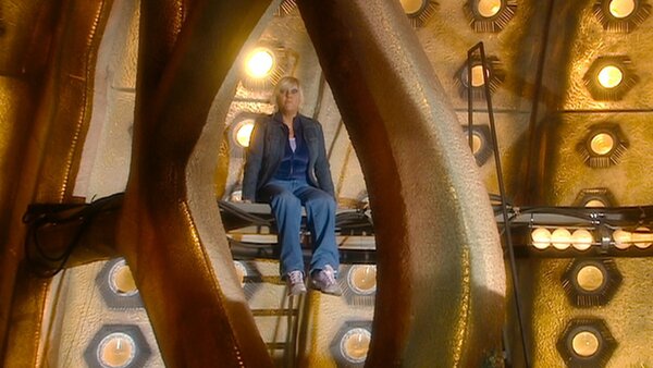
9. The RTD Era TARDIS (2005 - 2010)

From very early on in Doctor Who's history, the TARDIS was a place of safety. That's why The Edge of Destruction was the perfect third serial for the first season, because just as Ian and Barbara were becoming comfortable with the Doctor and Susan, the TARDIS became a place of danger.
Since then, returning to the brightness of the TARDIS with its comforting white walls became shorthand for safety. However, you don't get that with the RTD era TARDIS, which is an almost oppressively dark and dingy place. It's clear that RTD sees the TARDIS as a means to get the Doctor and their companions from A to B, and wasn't as interested in developing it beyond the console room as other showrunners were.
It's telling that it was old-school Doctor Who fan Mark Gatiss who wrote the Doctor's hilariously convoluted directions to the TARDIS wardrobe in The Unquiet Dead. But oddly, the set is designed in such a way that it's hard to envision the ship beyond the main coral console room. Where are the other passageways leading from that self-contained central platform?
Still, this is an undeniably iconic and beloved TARDIS interior. It looked cool in its green and red lighting variants, and had an interesting multi-level structure to the console room (see the Doctor's horrified realisation that Jackie Tyler is still onboard in Army of Ghosts).

It was also very spacious, with plenty of room for lots of companions. The energetic Tenth Doctor had tons of space to dash around the console, flicking switches like a madman. Which he often liked to do.