Every Doctor Who Title Sequence Ranked Worst To Best (2025)
8. The Eleventh Doctor (2010-2012)
The shift from RTD1 to the Steven Moffat era was likely the first experience of major change for many viewers of Modern Doctor Who. As such there was a fine line to be trodden in order to make sure that those viewers left feeling uneasy by the changes wouldn't abandon ship. The new title sequence did this very well. While the visuals were distinctly different, the overall motion and concept of the sequence wasn't too far removed from the previous offering and therefore kept an air of familiarity amongst the changes.
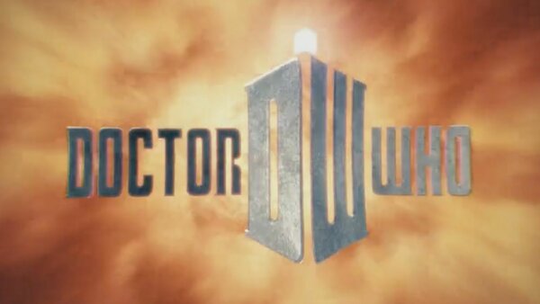
The cloud-like variation of the time vortex worked really well with the more whimsical, fairytale vibes of the Eleventh Doctor's era, as did the tweaks made by Murray Gold on the theme music itself. The stone-like effect on the text, while maybe not intentional, also feels very fitting for an era so focused on the Weeping Angels; and the formation of the TARDIS shape using the "DW" initials was a stroke of creative genius. It's genuinely surprising that this had never been done before.
This sequence remained consistent across Series 5 and 6 (with the addition of Arthur Darvill to the credits in the latter). Come the first half of Series 7, however, things took a turn. And not for the better. Each week the "Doctor Who" title was covered in a cheesy looking texture to fit with the "theme" of the episode – from dinosaur scales to the Statue of Liberty. But the most outrageous change for Series 7a was the use of what looked like an early 2010s Instagram filter over the entire sequence which seemed to get darker and darker with each passing week. What were they thinking?
A strong start with Series 5 and 6 but a real mixed bag heading into Series 7. A mixed bag that only got worse.