10 Worst WWE Pay-Per-View Posters Ever
2. SummerSlam 2006

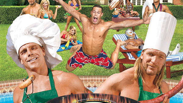
The poster of SummerSlam 2006 hurts the eyes. Do not look at it for more than four seconds at a time or you risk long-term damage to your helath. It's an overbearing busy image, filled with bad puns and amazingly terrible Photoshopped images.
The top wrestlers got together over the summer to have themselves a pool party, while all facing the same direction. And if you order the event, you will watch these people fight other people not on the poster. Make sense? No, of course not!
Also, you know for damn certain that HHH was given the small wiener to hold in the original image, and then he politiked backstage for a month until they changed it so that Shawn would be holding it.
SummerSlam 2006 is the pinnacle of terrible wrestling posters, it's one of the worst visual images ever created, and only pure, repeated laziness beats it out...