13 Ups & 4 Downs From NJPW Wrestle Kingdom 13
Downs...
4. Poor Set Design

A minor Down, but a Down nonetheless.
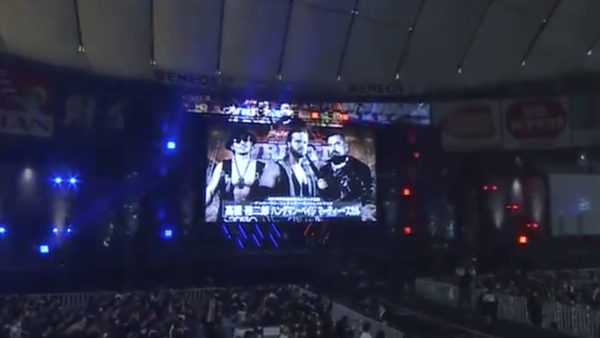
Aesthetics matter. When the show looks big and bold, the show feels big and bold. WWE dress their WrestleMania arena with a far grander budget than any other pay-per-view to convey its importance and heighten the spectacle, and NJPW, to their credit, usually do a great job with Wrestle Kingdom in that regard. 2018 saw a giant Tetsuya Naito eye watch over the building, with each of the previous few years conveying a similar sense of grandeur. By comparison, WK13 was lacklustre.
All we got was a slightly-bigger-than-usual screen and the usual wide stage. That's it. No fancy gimmick, no extra mile... nothing.
Though far from a big deal, it's something that needs to be mentioned as there should always be an immediate 'wow' factor when Wrestle Kingdom goes live, and you see that beautiful, beautiful set for the first time. It's a shame the new regime seemingly disagreed this year.