7 Ups & 3 Downs From WWE WrestleMania 38 (Night 1)
Ups...
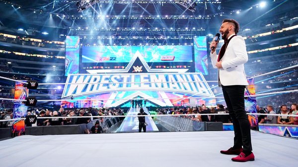
7. The Set

A smattering of fans on social media thought WrestleMania 38's set was underwhelming. This guy doesn't agree - if anything, WWE's design was clean and classy, and it was a neat touch that wrestlers came from underneath the gigantic 'Mania logo in the middle.
All of those star motifs made everything look like a Cowboys' home game too, which was surely the point. Was it as epic as some previous sets from down throughout the years? Maybe not, but it was hardly a miss. Wide shots of the stage were visually stunning.
There was a remarkable lack of CGI too.
WWE didn't go overboard or try to make the set a focal point. The actual matches, and the wrestlers working them, were very much in the spotlight. That ramp, whilst still lengthy, didn't seem as long as some others either. 'Stone Cold' was probably grateful for that!