Why WWE's SmackDown 'Throwback' Set Was Such A Letdown
WWE missed a huge opportunity on the special 'Throwback' episode of SmackDown.

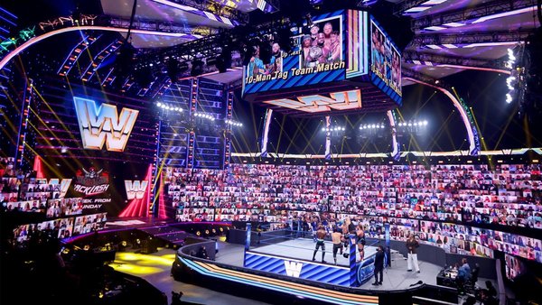
Anyone hoping to see that classic swirling set or the iconic 'big fist' prop on WWE's 'Throwback' edition of SmackDown would've been disappointed.
The company went for a typical retro look instead. They did use the old SmackDown logo for transitions and other graphical assets, but used a fairly plain-looking entrance stage that weirdly included the classic 'block' style emblem.
That...was never on SmackDown. The show debuted in 1999 when the then-WWF proudly boasted its 'scratch' logo, so it's confusing that WWE decided to bring back the late-80s/early-90s feel here. They had to know that the set they plumped for would be a major letdown to those who have watched SmackDown since the early days.
'Throwback' was a missed opportunity.
Sure, it would've been a pain in the arse to set up a massive fist inside the ThunderDome, but there was nothing stopping WWE from doing something different with the numerous LED screens on stage. The fact they didn't was sheer laziness - this was not representative of SmackDown's history at all.
That fist, or at least some older SmackDown logos, should've been displayed on the trons.