WWE Change Great Balls Of Fire Logo Yet Again
We wonder why... ?
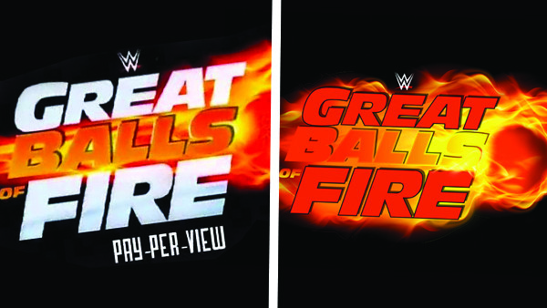
They say you should never give in to bullies, but when the source of that bullying is a company logo which basically looks like a massive !*$% and balls, it might not be the worst idea. So it is to the surprise of absolutely nobody that WWE have revised the motif for July sizzler Great Balls of Fire once more, the last effort roundly ridiculed for its obvious phallic imagery.
The fourth attempt at coming up with something which wouldn't leave everybody tittering at the back of the class was subtly revealed on Raw last night. It's only a minor adjustment, but it's a fairly significant one.
It's the third time the company has revised the show's logo, though you have to wonder what went on during the executive meeting for the previous version. How could an entire room of designers and company officials fail to spot the, um, glaring issue? Given the event's name, was it an intentional ploy to gain attention? They say there is no such thing as bad publicity, but I'm not so sure this extends to universal ridicule.
The new logo is far more sensible, far more boring, dropping the fiery todger albeit retaining the brand-crucial flaming gonads. It's a shame; there's no point to life once you don't find a crude rendering of a willy amusing. Puerile hilarity trumps tedious maturity any day.
That said, the PPV is still called 'Great Balls of Fire'. That's something, at least.