10 Movie Trailer Cliches Everyone Is Tired Of
1. The "Dramatic" Strobe/Flicker Effect

And finally, a trailer cliche that's somehow stuck around forever, despite how much people hate it.
The strobe/flicker effect basically requires the editor to randomly splice between a meaningful image from the movie and a black screen in quick succession, presumably to hammer home how awesome a moment is...or something?
It's used most prominently in horror trailers to show something scary while also obscuring the finer details of the monster or a character's death, but it's also used in blockbuster fare to headache-inducing effect.
Somebody somewhere has probably carried out a study which suggests that these strobed images are the ones which lodge themselves into the audience's brain the strongest, but it's still a fundamentally dumb effect that should've been ditched years ago.
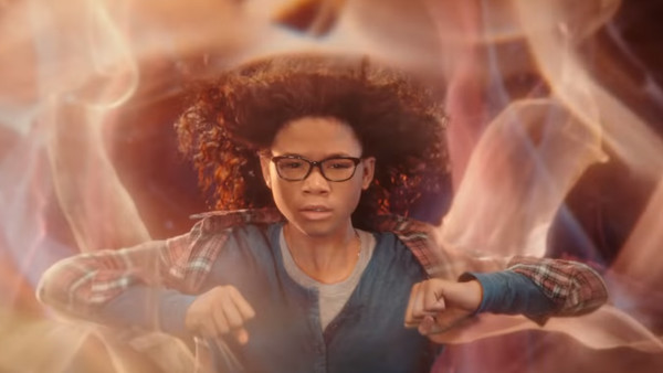
Example: The most memorably irritating recent example was in A Wrinkle in Time's trailers, where protagonist Meg (Storm Reid) had her hero shot inter-spliced with a cheesy title card. And still, nobody bothered to remember the movie.
Which nagging trailer cliches are you done with? Shout them out in the comments!