10 Ways Trailers Let You Know A Movie Is Secretly Awful
8. The Title In Bold, Red Fonts

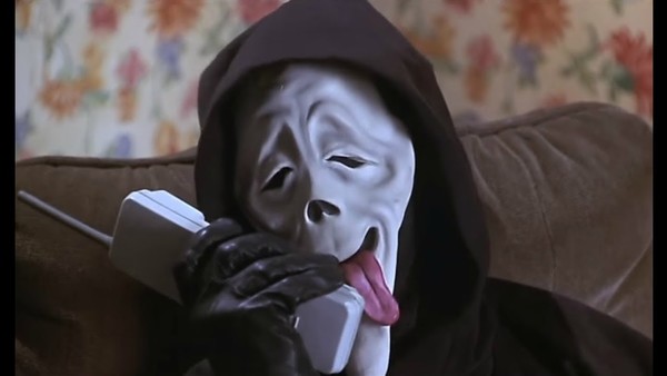
Notable offenders: You Don't Mess With The Zohan, Epic Movie, Scary Movie
As David Fincher has demonstrated in many of his movies, delivering a good title screen is something of an artform when done well. The fonts selected coupled with lighting, particle effects and a hint of animation can really emphasise the tone and feel of the movie.
By the same token, really bad movies similarly feature titles which reflect the low standards of the film being advertised. They are often lazily thrown together using fonts that any one of us could dig out on our free copy of Photoshop CS2 in a few seconds, with the most frequently seen examples being those movies which feature titles in big, red type.
To the untrained eye these bold titles are intended to let audiences know that the movie is fun and exciting - to anyone remotely savvy about graphic design they indicate cheap, lazy production values which is inevitably reflected in the quality of the film. Some of the most egregious examples of this tend to be crass comedies, with films like Daddy Day Care, The Nutty Professor and Norbit standing out from the crowd. It's probably not a coincidence that many of these star Eddie Murphy.