Ant-Man And The Wasp Review: 6 Ups & 5 Downs
4. The Flat, Dull Visuals

One of the loudest complaints about the previous film was that the visuals were incredibly underwhelming, with the lighting set-ups, general cinematography, shot selections and production design all evoking the vibe of a mid-budget TV show.
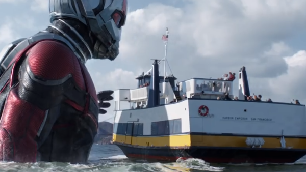
Sadly Ant-Man and the Wasp isn't really any different, and aside from the solidly impressive visual effects, the sequel again is a frequently drab film to look at.
Pretty much any time there isn't some shrinking or embiggening going on, the film looks disappointingly cheap, once again leaving fans to consider how much better the movie probably would've looked if Edgar Wright was in charge.
Given that the recent likes of Guardians of the Galaxy Vol. 2, Thor: Ragnarok, Black Panther and Avengers: Infinity War have boasted some of the MCU's most spectacular visuals to date, this often looks positively quaint by comparison.