Ant-Man & The Wasp: Quantumania Review - 5 Ups & 5 Downs
4. The Wildly Uneven Visuals

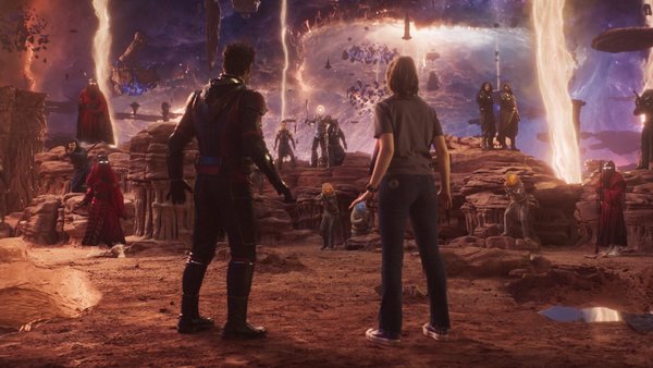
Quantumania might well be one of the worst-looking $200 million movies ever made.
For starters, despite its inspired Quantum Realm setting, there's very little interesting or creative about the world-building within it - the locations and various creatures encountered feel liberally lifted from other, better sci-fi movies, especially Star Wars.
But even the basic fidelity of the VFX are hugely underwhelming - everything screams "Green Screen!" and looks distractingly artificial, and that's without even getting into how ridicule-worthy MODOK looks in this movie (but more on that later).
Yet worst of all the aesthetic is dominated by an earthy brown tone that will leave audiences desperately craving some actual colour, and even the action sequences - easily the highlight of the film - are undermined by bafflingly choppy editing.
All in all Quantumania exemplifies every visual criticism people have had of the MCU over the years, that they spend egregious amounts of money on products that are not merely cookie-cutter but at times legitimately ugly.