Finding Dory Review: 7 Ups And 3 Downs
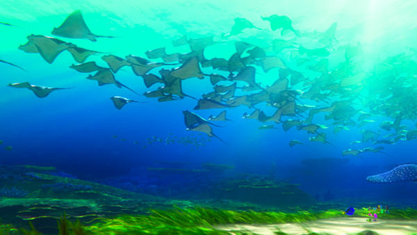
6. The Visuals

When Finding Nemo came out, it marked a watershed moment for Pixar: it was a beautifully crafted canvas, almost photo-realistic in a way that its predecessors weren't and it looked and felt very much like a labour of love.
With years of technological progress since then, there was always a danger that Finding Dory could have been - pardon the pun - an exercise in treading water. Or at least that it could have been perceived that way because the audience is so used to being wowed by Pixar's visuals. But it goes way beyond that.
In fact the best thing to be said about Dory's environment is that it doesn't actually feel like just an expression of technological advancement. It's not showy in a manipulative way, but the underwater worlds have more depth and more complexity and there are shots in there that look like paintings (again). And beyond even the beauty there's an eery, unnerving quality that suits the moments of darkness and actual terror (and make no mistake there are some).