Godzilla Vs. Kong Review: 6 Ups & 4 Downs
Ups...
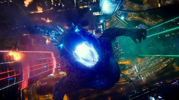
6. The AWESOME Visuals

What everyone will surely agree upon is that this is an incredibly well-presented film, ensuring practically every dollar of its colossal $200 million price tag has ended up on the screen.
While many complained that the previous MonsterVerse movies suffered from blurry CGI elements and bland, overly grey environments, Godzilla vs. Kong is a bright, vibrant, visually dynamic movie from start to finish.
Adam Wingard's creative shot selections are buffeted by Ben Seresin's gorgeous lensing, making inspired use of neon lighting in particular, but also frequently changing-up the colour scheme throughout.
But above all else, the visual effects are stellar, rendering both titular monsters with an eye-popping level of detail which will make the most of whatever screen you're able to view it on.
Considering how few massive-budget, CGI-filled tentpoles audiences have had to feast on over the last year, this is a much-needed tonic indeed.