Star Trek Beyond Review: 8 Ups And 2 Downs
2. It Feels Like You’re In The Frontier

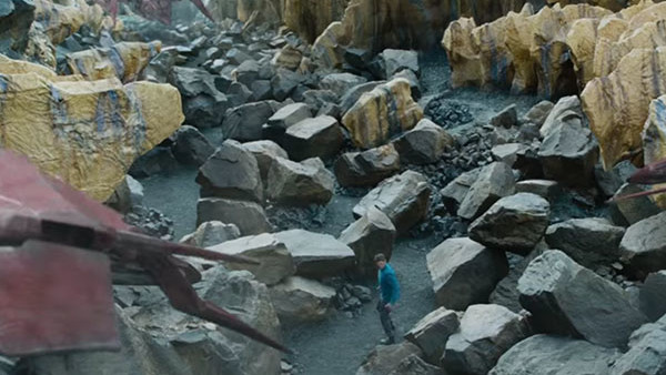
Set design in Star Trek was always one of necessity. What’s near LA that can pass for an alien planet? Good, just throw in some fake boulders and a couple of costumed aliens and you’re done.
Star Trek Beyond honours that "style", but makes it looks incredible. The planet most of the film’s set on feels like real locations done up with solid set-dressing, and the design is very reminiscent of what was achievable on a 1960s TV budget, just pushed so it feels real. There’s CG augmentation, but you can’t see the lines, and the aesthetic is so welcoming you don’t really want to look for them anyway. Realism is clearly a big focus here, as evidenced by various moments with Iñárritu-style grime on the lens.
The space sequences are also gorgeous too. Gone are the constant close-ups and lens flare and instead there’s these massive wide shots of the Enterprise flying tiny alongside swarms of ships or through nebulas that look incredible.