Teenage Mutant Ninja Turtles: Out Of The Shadows Review – 2 Ups And 3 Downs
The Ups:
2. It Looks Much Better

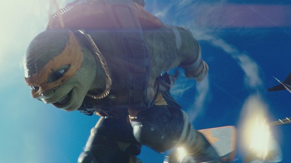
Like Transformers, this iteration of the Teenage Mutant Ninja Turtles is dominated by the patented Michael Bay-aesthetic saturated colours, mechanical sensibilities, slow-motion. Its nauseating and dominates whatever property hes taking on, but, while still being rigidly in that school, Out Of The Shadows does at least try and mix things up a little.
The CGI is strong and by introducing more fan favourite monsters theres a greater leaning on it in a more cartoony way simply having a giant warthog and a rhino means you have to tone down the Bay.
Theres a creativity to the shooting style too. Instead of everything being incomprehensible shakey close-up, new director David Green (who produced fine mediocrity with Earth To Echo) tries to mix things up. The camera pans through the action and he makes great use of wide-shots to actually show the Turtles a part of New York City..