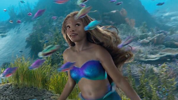
The Little Mermaid Review: 5 Ups & 5 Downs
Downs...
5. The Underwhelming Visuals

Given that Disney spent $250 million on this thing, you'd at least expect it to look great, right?
Well, not quite.
The Little Mermaid has its moments, sure, but for the most part it's such a disappointingly murky, stylistically anonymous piece of work, lacking the necessary artistic flair to match the colourful vibrancy of the original animation.
In the misguided pursuit of a more "realistic" aesthetic, the colours are often muted into a bland sludge, especially when on land, and even the underwater scenes lack the eye-watering visual pep you'd expect. Avatar: The Way of Water this ain't.
The VFX never quite persuade that we're actually being transported to an underwater kingdom, and beyond all this, director Marshall doesn't offer much in the way of creative or even basically memorable camerawork.
It is a film that, stylistically at least, feels like it was slung together by a committee, and in turn falls far short of the original's more spritely, inspired palette.