Transformers: Rise Of The Beasts Review: 4 Ups & 6 Downs
5. The Flat, Mediocre Visuals

While few were expecting brilliant writing from this movie, the biggest disappointment is surely the generally middling visuals.
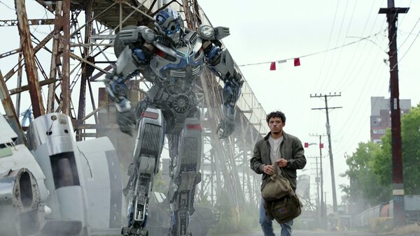
Though the VFX renderings of the Transformers themselves look terrific, the movie's overall aesthetic is so unrelentingly drab, opting for a more muted style that couldn't feel more opposite of Michael Bay's tendency towards colourful hyper-saturation.
Bar a few spritely moments, this is a film dominated by dull greys, browns, and earthy greens, which fail to provide much compelling contrast with the Transformers themselves.
For a $200 million movie it's a shockingly flat piece of work from a stylistic perspective, especially during its "epic" final battle, where it gives itself over entirely to a gaudy muddy-brown colour scheme reminiscent of Avengers: Endgame's similarly garish climactic digital battleground.
For all of Michael Bay's problems as a filmmaker, the man knows how to craft an eye-popping image, yet under the decidedly less-experienced Steven Caple Jr. (Creed II), Rise of the Beasts is almost entirely devoid of visual personality.