Horizon Zero Dawn Gameplay Roundup: 11 Things You Need To Know
4. The HUD Is Cluttered (But You Can Turn Many Things Off)

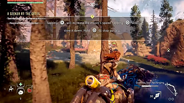
My personal negative from the footage on show, the game's HUD feels incredibly cramped during what we've seen so far. There are already some pretty invasive icons, meters, XP trackers and 'equipped items' symbols cluttering the corners of the screen, but pop your vision mode on and everything ahead of you lights up too.
Enemies can be tagged, structures, bandit camps and life bars for foes also show up, all alongside a purple framework hue to denote the field of vision you've activated.
It's not inherently ugly by any means, but for sheer fluidity of play, there is a feeling of the HUD being a little too cluttered, which is why it's been music to my ears to discover Game Director Mathijs de Jonge saying you can actually turn a number of these elements off - or at least increase their opacity.
To be fair, CD Projekt RED tweaked The Witcher 3's HUD options post-launch, so if this becomes an issue for a large amount of players, there's every possibility Guerrilla will provide a fix.