10 Hilariously Terrible Album Covers And Why They Exist
2. Village People Renaissance
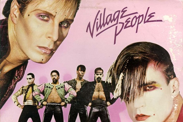
RCA RecordsWait a minute, the Village People released more songs than just YMCA and In The Navy? Shockingly, yes. Over the course of their career the band released a total of nine studio albums, five of which were certified platinum in at least one territory. Over the course of their career the band sold more than one-hundred million records worldwide, which is pretty impressive for a band that largely relied on the gimmick of being extremely camp. Which brings us to their seventh studio album Renaissance, released in 1981, and the glorious piece of artwork that adorns its front. The cover shows the various members of the band decked out in leather and caked in thick make-up, their fringes straightened and flattened against their foreheads in anticipation of a million emo haircuts several decades later. The whole thing looks totally awkward, and has about as much stylistic consistency as a spilled tin of paint. Covers in the eighties could be cheesy, but the artwork for Renaissance is just hilarious bad. You've got to wonder what exactly was the band thinking? Well, the truth isn't particularly complicated. After releasing six albums of disco music, the band were desperate to reinvent themselves. The only problem was that the Village People were known for each having signature costumes, and so they attempted to create new costumes and personas more in line with the New Wave genre. The result of this was the cover of Renaissance, which was meant as an introduction to the band's new aesthetic but really only scared people away from the record, which was described by critic Stephen Erlewine as "simply an embarrassment that never should have seen the light of day".