10 Worst Sports Jerseys Of All Time
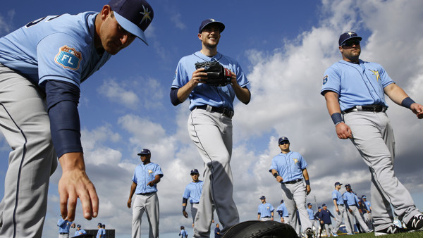
8. Tampa Bay Rays Spring Training Jersey (2016)
For the first ten years of their existence, Tampa Bay's baseball team was called the Devil Rays, wearing logos on their jerseys which featured the titular animal. Then, in 2008, they shortened the name to the Tampa Bay Rays, which sounds better and still maintains their identity.
In recent years, the team has defied their heritage, deciding that the Rays in their name now alludes to the rays of the sun, which has resulted in them bringing in a 'sunburst' alternative logo, which is arguably the worst logo in baseball. For 2016 Spring Training, the Rays decided to ruin their light blue alternate colours by leaving this monstrosity of a logo on both the caps and jersey, leaving the team looking less like a professional baseball club and more like a group of men who decided to buy a bunch of cheap baseball styled shirts from Primark.
The Devil Rays jerseys may not have been the best, but at least they gave them an identity, something which is missing in the organisation's push for the sunburst logo.