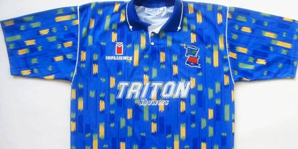
This kit, designed by defunct makers Influence, was known among Birmingham City fans as the Paint Box Kit, due to the multi-coloured pattern and logo. It was hugely derided due to the departure from Birmingham's traditional plain royal blue and the fact that the design looked like a pair of pyjamas. It also featured the orange, white and green colours of India on the socks to represent the unpopular club owners, the Kumar Brothers. This attempted kit change, although not too radical, will resonate with some modern-day fans. It was an earlier example of big-money owners taking control of a club with the intention of altering its traditional image to fit their business plan. Life-long fans of Cardiff City will sympathise as their famous blue was changed to red not long ago to attract more fans from across Wales, and since being taken over by Manchester City owner Sheikh Mansour, Australian club Melbourne Heart are soon to be renamed Melbourne City and forced to remove their traditional red and white shirts and don sky blue.