DC's Titans: 9 Reasons It's Already A Dud
2. It Looks Cheap & Generic
It's disappointing that Titans has no real visual identity of its own and basically looks like...every other cape show you've ever watched.
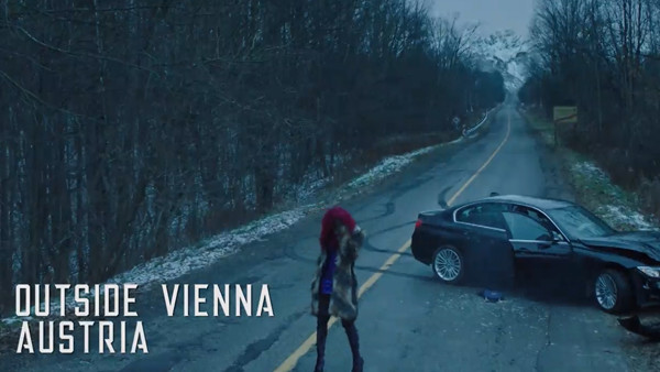
The cinematography in particular has an unfussed, garish digital look to it, while some embarrassing location doubling tries to make the U.S. resemble Vienna by just pasting some mountains in the background and inserting some blatant shock shots of the Vienna city centre.
We've already talked about the roughshod visual effects, but on a more basic visual level, there's little creativity or imagination to what we're looking at. It all feels pulled straight out of the superhero TV show playbook, where deadlines are tight and shots have to be achieved as quickly as possible.
Advertisement