Doctor Who: 20 Genius DeviantART Creations You Need In Your Life

11. Dr Who Character Wallpaper The Master
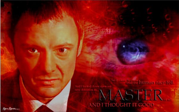
By: RedAntQueen There are many, too numerous to mention in fact, examples of made-for-wallpaper pictures on DeviantART. Many of them are good; some are simply excellent. It is difficult to achieve the right level that makes you want to see the same art every time you login, or gaze over it for yet another moment when you're getting worn down after a day's skiving on the job. This achieves that happy balance. It's in the mixed media category, so that could mean anything. Essentially though, it's all about the composition and this has what it takes. It's not sentimental and, believe me, too much of that cloying stuff in fan art sticks to you like napalm in the end. This picture simply takes a memorable quote from the show, artfully arranges meaningful paraphernalia from the episode €“ such as the Toclafane here €“ and hey presto, beautiful composition. A mysterious blue eye fading toward the background nicely contrasts the red. That addition gives something to ponder, nicely rescuing the whole idea from lapsing into that other disaster of ill-conceived fan art: forgettable eye candy.

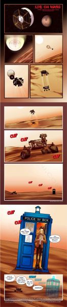
10. Dr Who Curiosity Life On Mars

By: onegemini Among many people, good comic art has always been underrated, viewed as a sort of Cinderella department of serious artistic endeavour. This is doubly so when you recognise that its greatest critics have always been us, the genre devotee rather than art specialists. Hordes of us, we populist consumers, have made people such as Frank Miller and Sin City 'respectable'. Part of comic art's caché is that is doesn't become mainstream, (like I had hoped for Banksy), so it will do very well if if can remain firmly within the genre fan's domain. This piece is an excellent example of that kind of thing. It is well realised, beautifully drawn, with careful consideration over how to depict each scene. It also tells a decent little story to boot, and demonstrates the sort of skill in execution that causes serious collectors to belatedly return to it after an artist has departed us and proclaim it to be 'for future generations', or some such nonsense while they pocket the wedge from selling it on. Personally, I just like looking at it. It is one that you will have to actually go over to the site to see properly after you've finished here, naturally - don't want you running off too soon! It is one of those that expands on clicking it so that you can see the full thing, which we are not geared up to do here.

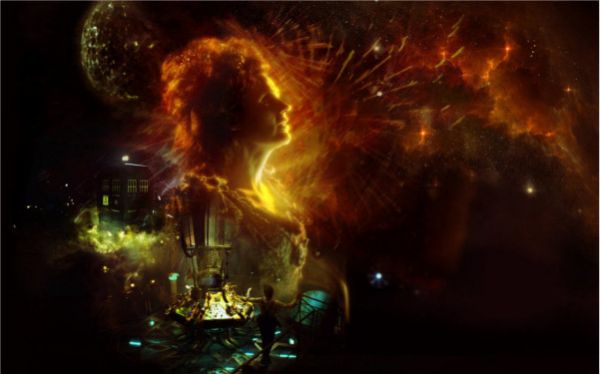
9. Alive

By: sueworld In the second of this artist's work we see how sensual the subject matter can be. As with 'Starry Starry Night' your eye is expertly made to follow the image from scene to scene, but finally we linger upon the face of the TARDIS herself. It is eternal, gazes out upon all space and time, and perfectly complements The Doctor's joyous little dance at 6-o'clock. There is a lot of tribute work on DeviantART; however, seldom do you get a picture that has such an edge to it. All players in it seem to be joined together in a common feeling of joy at life. Even the plain wooden police box seems to fulminate with passion as it billows with clouds of smoke around its base. Tribute art belongs on the walls of a certain type of fan's bedroom. There are a lot of you out there, so don't delay.

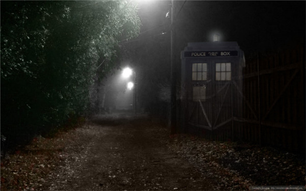
8. Dr Who Arriving TARDIS

By: Karsciyin Some people speak about photo-shopped pictures as being simple to do. Well, maybe the software does help there, but rigging something up in Photoshop or GIMP is actually all about telling a good lie. It turns out that some are better at fibbing than others. What do I mean by that? A standard, clumsy fault found in too many pieces, professional ones included, is where the light on the object that's been added to the scene is inappropriate for the setting. Perhaps it's a shadow in the wrong place, or rendered with the wrong intensity. Sometimes it's that the effect is jarringly staged and the 'lie' the artist is trying to tell us, the viewers, ceases to convince. This picture has a truthful, slightly imperfect focus and the arriving TARDIS is rendered with transparency to just the right degree to make it match. It really does seem to materialise in a gloomy, suburban lane. If it has one minor fault then it's that a suddenly arriving TARDIS would claim centre shot, because of the surprise value. But hey, great picture nevertheless.

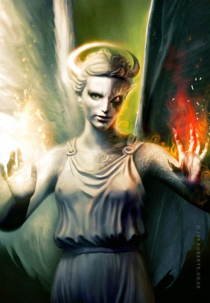
7. Angel

By: Joe-Roberts Interestingly, there's no real evidence that this is actually Dr Who art. The artist doesn't comment, merely classing it as Digital Art/Mixed Media /Macabre & Horror. Nevertheless, a good many of those that left a comment on it thought it was! I'm going to include it for two reasons. Firstly because I, and others, think it is Who art and secondly, because it deserves to get a view. It's magnificently disturbing. Nearly anyone can blend together an impossible duo to reveal some sort of dualistic opposition, or relationship: Darth Vader and Obi-Wan Kenobi; Dr Jekyll and Mr Hyde; Adolf Hitler and Winston Churchill; Jedward, etc. Maybe not Jedward then, because that would be both pointless and wrong. The trouble is that once you've crunched your antithetical icons together many artists lose it at that point. This one doesn't. In this version we see Angel and Demon fused into a single personality, but the eyes are the convincer holding the whole thing together. Most eyes in this sort of mash-up are depicted with different expressions at left and right, and you end up feeling that two separate minds coexist. Not here, because both angel and demon have the same intent, the same priority. One is good and one is bad, but never forget that you are the object under scrutiny. Your status is the same for both, so each coldly evaluates you; one does it to find out if you're good while the other yearns to see something bad. And on the question of it truly being a Weeping Angel? Of course it is €“ the artist just blinked once and forgot, that's all! He's probably in the court of King Harold even as we speak, wondering how he got there.

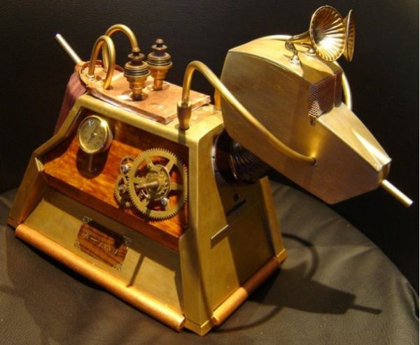
6. K-1889 Steampunk Dr Who K9

By: Sydeian I cannot honestly claim that Steampunk is particularly my thing, but I know quality when I see it. That said, the interior of the eleventh incarnation of The Doctor's TARDIS, the bright orange one I mean, could be said to veer towards that style and I really do love that. This version of K9 has been featured on the BBC, according to the artist and appears in the short story fan fiction, 'Time And Tide.' Whatever I think about Steampunk is irrelevant, since this is a superb piece of craftsmanship by any standards. The artist has other Steampunk items photographed in his portfolio, including a black version of Who's dog, K-1909. Within any artistic style, be it Impressionism, Art Deco, or Expressionism, there is good composition and there is bad. Impressionists that don't know how to render Plein Air don't know how to do Impressionism and if your Art Deco is clumsy then it ain't Art Deco. This K9 is all that is great in Steampunk. and it's definitely a dog with personality.

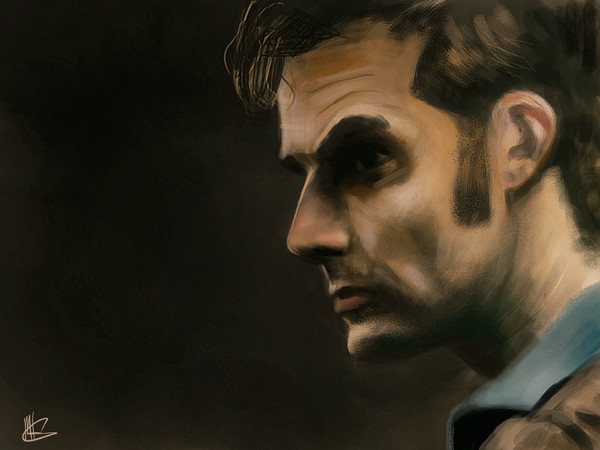
5. Dr Who Fan Art 1

By: mking2008 There are many, many portraits of individual Doctors across the DeviantART site. I'm not saying this is the best of them; however, it has a quality most of the others do not. It's gritty. There is no sense of adoration in this picture. The Doctor is portrayed in much of the other art up on the site most often as a hero. I'd go as far as to say that most is straightforward hero worship. Much of it is painted, drawn, or mashed-up to a very high standard and this one is of high quality, too. I don't wish to suggest it isn't by comparing it with other works. It is digital art constructed using painting and airbrushing tools by the look of it. So, what does the picture uniquely tell us? It tells us that The Doctor's world, the world we don't see on the brash, brightly lit TV show, might be rather greyer in reality. With its muted browns and deep, murky ink blacks, The Doctor is rendered as a hawk eternally weighing the stark reality of the choices he has to make. He's not in it for the ride and his world is as dangerous as it is glamorous.

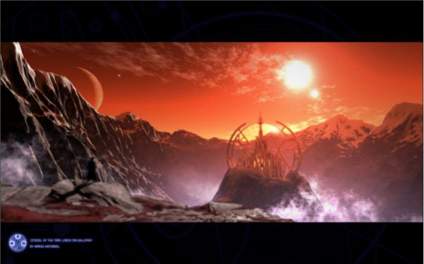
4. Gallifrey

By: Amras-Arfeiniel This is a great 'picture this' work, based upon a description given by The Doctor in the episode, The Sound of Drums:
"...it was beautiful. They used to call it the Shining World of the Seven Systems. And on the continent of Wild Endeavour, in the mountains of Solace and Solitude, there stood the Citadel of the Time Lords. The oldest and most mighty race in the universe. Looking down on the galaxies below, sworn never to interfere, only to watch."
The scripted lines themselves are a piece of poetry in their own right, so something poetic should be used to depict the words. The picture does just that. It's very cleverly designed, in many ways mimicking those spectacular vistas you see on holiday posters of places you would very much like to go, but could never afford. I look at this and just want to go there. In the foreground is the silhouette of The Doctor, slightly out of focus in keeping with the sense of perspective being created in the work. There is very effective use made of golden section in the composition and precise complementary colours in the orange and blue hues, both of which cause the picture to give off a tremendous aura of harmony. It's probably what heaven is like.

3. Doctor Who

By: Joe-Roberts If the previous choice by Roberts was ambiguous over its Dr Who credentials then this one is not. Also by the same artist as Angel, this depicts a super-real TARDIS flying through the Time Vortex. What do I mean by super-real? If you watch the opening credits to the TV show and you see the TARDIS tumbling down through the vortex it's battered and buffeted at all points along the way. To my mind, this has the overall effect of making the TARDIS itself slightly unreal. It is weightless, ethereal, almost cartoon-ish in the way it's rendered. The Joe Roberts version takes on solidity. There is the merest hint of ponderous movement expressed in the fanning light at top left of the picture. The vortex itself is huge and substantial. The Doctor's enemies, frozen in Time down the right of the picture, are reduced to mere incidental blips in history as the TARDIS sweeps majestically by them.

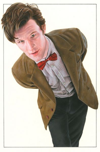
2. The Doctor

By: caldwellart This piece gets in near the pinnacle of my list, because it's just a superbly well executed piece of art using traditional techniques. The portrait has been laid down using acrylics on water colour board and demonstrates oodles of artistic nonce. The tonal values are consistent throughout and The Doctor has been depicted as if in a photo studio next to a reflective silver sheet. That choice adds to the starkness of the image and high tonal values of the piece, allowing us to focus completely on the subject to the exclusion of everything else; it also gives the artist opportunity to make much of the highlights caused by the off-canvas light sources. But the artistry doesn't stop there. He's used foreshortening in the composition by having The Doctor lean forward and depicted him with hair and jacket breaking the frame of the picture. This device enhances the sense of perspective and immediacy of the pose. Matt Smith is probably not that pink in actual life, but the warm tones in the face and bow tie, contrasted with the subdued jacket and trousers, thrust his face even further toward the viewer's. Finally, the expression is closely observed using a different mood in each eye that I imagine accurately reflects Smith's in the flesh. It is both an object lesson in how to paint and a superb demonstration of how to capture a personality during a unique moment of time.

In this post: 
Doctor Who
 
Posted On: 
Contributor

Hello, I'm Paul Hammans, terminal 'Who' obsessive, F1 fan, reader of arcane literature about ideas and generalist scribbler. To paraphrase someone much better at aphorisms than I: I strive to write something worth reading and when I cannot do that I try to do something worth writing. I have my own Dr Who oriented blog at http://www.exanima.co.uk