Locke & Key Review: 5 Ups & 5 Downs
3. The Inconsistent Production Values

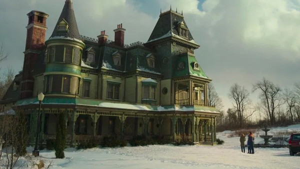
Like most of Netflix's original content, Locke & Key's base visuals are mostly rock solid: the sweeping cinematography looks frequently gorgeous in 4K, and the production design of the Locke house itself is indeed quite remarkable.
But other aspects of the show's visual style sadly aren't quite up to par: the editing feels especially choppy, with an excess amount of unnecessary cutting around in the first half of the season in particular.
Rather than hold on gorgeous shots, there's this constant, anxious movement, and it's especially irritating during basic dialogue scenes that we're being so needlessly shuttled around visually.
Though the show is surprisingly sparing in its use of elaborate CGI, the effects are nevertheless a rather mixed bag overall, culminating in a throw-everything-at-the-screen CGI-fest in the season's final episode, which reveals just how limited the VFX budget truly was.
Given the money Netflix is known to pour into their prestige shows, it does feel like they perhaps cut a few corners too many here, and the sloppy editing does it no favours either.